Introduction
In the realm of brand identity, the logo serves as the visual cornerstone, encapsulating the essence and values of a brand. This case study delves into the creative journey of designing the AK OK logo, a symbol that represents the spirit of freedom, empowerment, and limitless possibilities. As the digital media agency entrusted with this task, APH embarked on a mission to create a logo that would resonate with AK OK’s target audience and communicate their unique vision.
The Logo Type
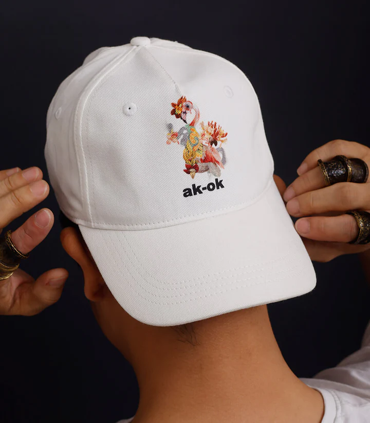
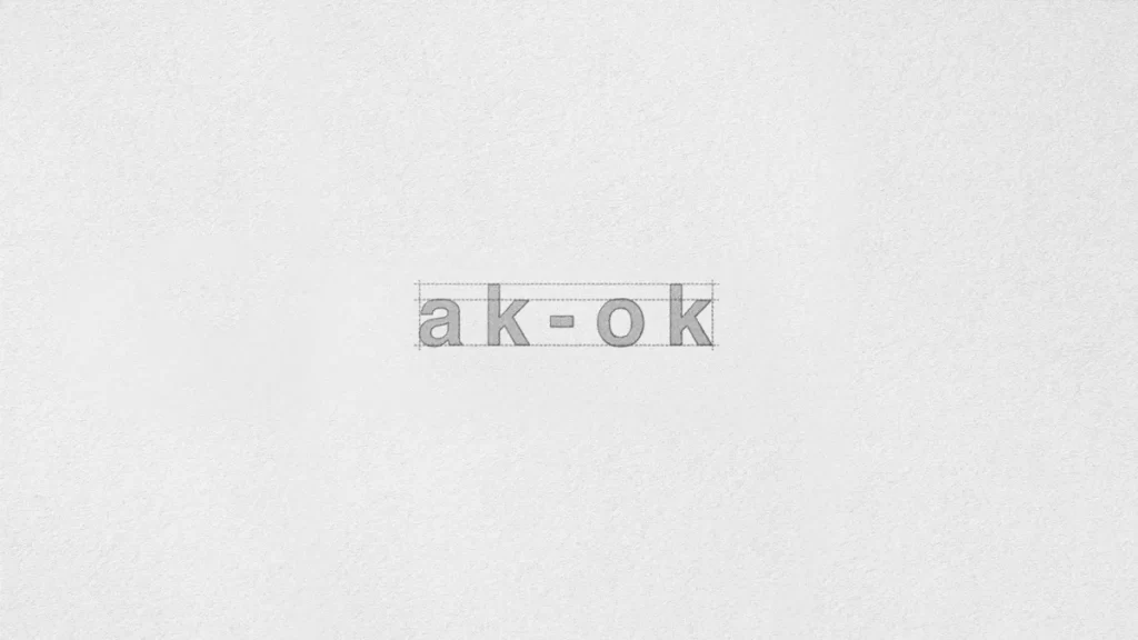
The AK OK logo is crafted with careful consideration of typography At the heart of this brand identity is the a distinct wordmark that embodies the essence of minimalism and modernity. The choice of font reflects the brand’s commitment to a clean, modern, and sophisticated aesthetic. Its bold, distinct letterforms are reminiscent of architectural lines, evoking a sense of strength and confidence. The decision to keep the typeface small and lowercase was a deliberate choice, reflecting the brand’s desire to convey a sense of approachability, authenticity, and understated sophistication.
The Logo Unit
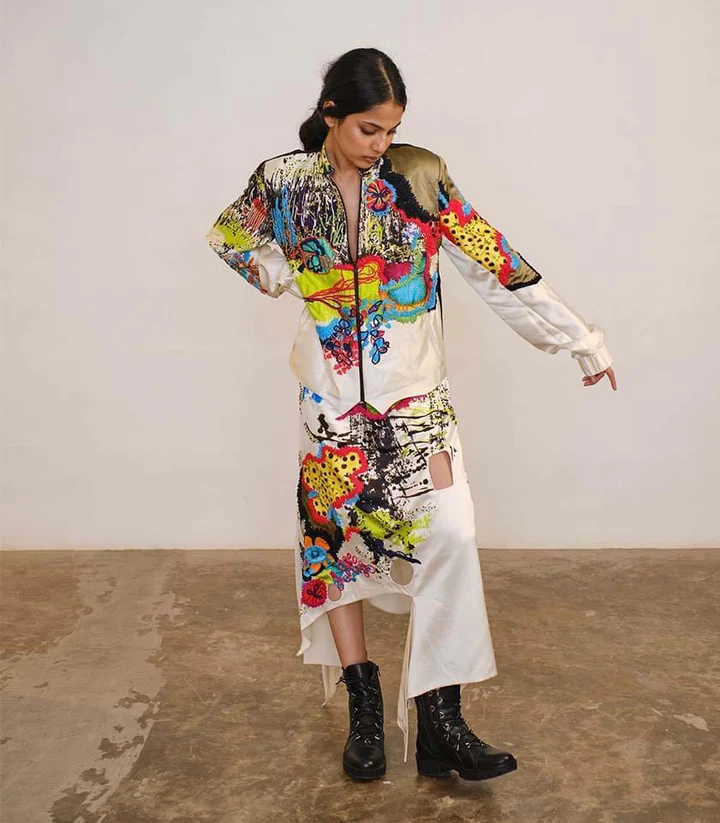
The AK OK logo unit is a harmonious combination of the brand’s initials, “AK” and “OK.” It encapsulates the spirit of freedom by sensitively layering Indian and international, traditional and futuristic references. The logo unit is meticulously designed to be bold, definitive, and lucid, mirroring the ethos of AK OK garments. It signifies the brand’s mission to break free from norms, expectations, and limitations, empowering individuals to let their spirit run wild. The use of lowercase letters gives the logo a modern and informal appearance. It communicates a sense of approachability and friendliness, which is what we wanted to achieve since it was to be the entrée of Anamika Khanna in the prêt and ready-to-wear segment.

Creative Process
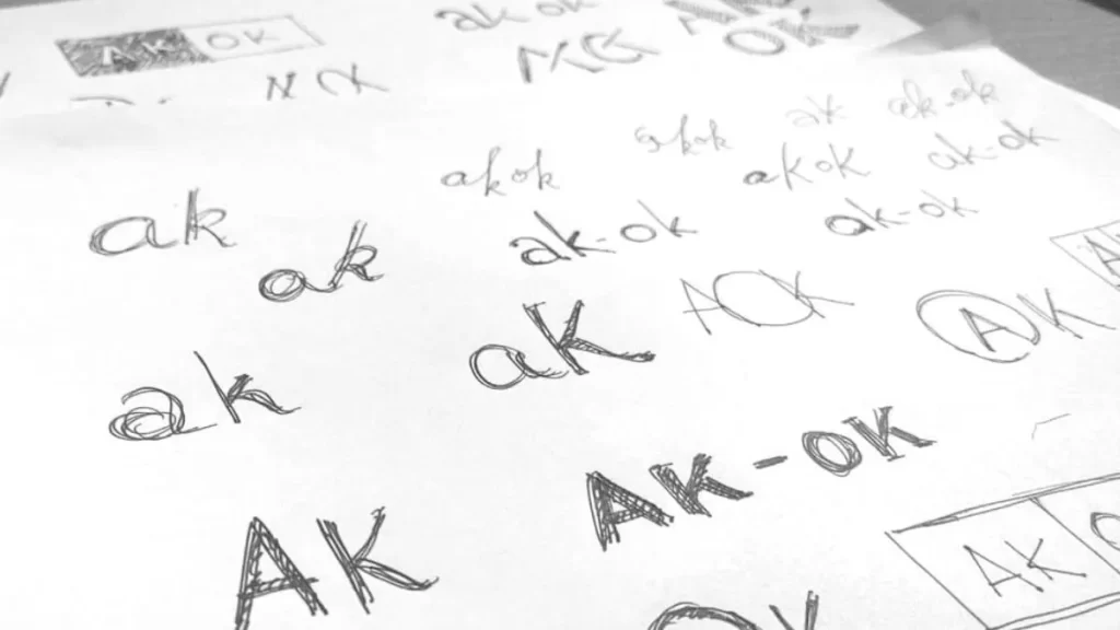
The journey of creating the AK OK logo involved a comprehensive creative process. APH’s team of designers delved deep into understanding AK OK’s brand values, target audience, and desired message. Through extensive research and ideation, multiple concepts were explored, with a focus on capturing the brand’s essence and unique blend of influences.
APH’s designers crafted various iterations, meticulously refining each detail to ensure the logo embodied AK OK’s vision. The final design emerged as a symbol of minimalism, modernity, and empowerment. Its clean lines, near-even weight strokes, and bold typography reflected a sense of design that characterizes AK OK’s creations.
Impact and Success
The AK OK logo has become a powerful visual representation of the brand’s identity, fostering recognition and connection with their audience. The logo’s adaptability across different mediums, from social media to packaging, ensures consistent brand messaging and recall. Its distinctive design has created a strong brand presence, reinforcing AK OK’s position as a leader in the fashion industry.

Conclusion
The AK OK logo design case-study exemplifies the synergy between APH and AK OK, demonstrating the agency’s ability to capture the essence of a brand and translate it into a visually compelling logo. The logo’s fusion of minimalism, modernity, and cultural influences resonates with AK OK’s target audience, empowering individuals to embrace freedom and self-expression. By using lowercase initials, the logo stands out from other brands that typically use uppercase letters. It helps create a distinctive visual identity for AK OK, making it memorable and recognizable.
By crafting a logo that embodies the spirit of AK OK, APH has contributed to the brand’s success in establishing a strong visual identity. Lowercase letters create a more balanced and visually harmonious composition. The AK OK logo serves as a testament to the agency’s creative prowess, commitment to client vision, and expertise in logo design.