PB Jewellers, a renowned name in the gold jewellery industry, wanted to enhance their brand identity and create a distinct visual representation that would reflect their bespoke designs and commitment to excellence. They approached APH to develop a new logo and brand identity that would capture the essence of their craftsmanship and elevate their brand image.
Challenge
PB Jewellers faced the challenge of standing out in a competitive market saturated with traditional gold jewellery brands. They wanted a logo that would not only showcase their custom designs and impeccable finishing but also exude a sense of opulence and elegance. It was crucial to strike the right balance between luxury and minimalism to appeal to their target audience of discerning customers and other designers.
Question
How could APH create a logo and brand identity that would reflect PB Jewellers’ commitment to bespoke designs, amaze finish, and luxurious appeal while maintaining a sense of elegance and sophistication?
Answer
To address PB Jewellers’ requirements, APH embarked on a creative journey to develop a logo and brand identity that would captivate both designers and customers alike. The key elements of the design were carefully crafted to embody the essence of the brand and create a lasting impression.
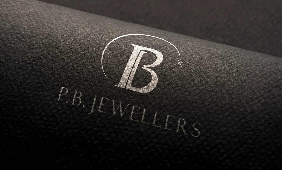
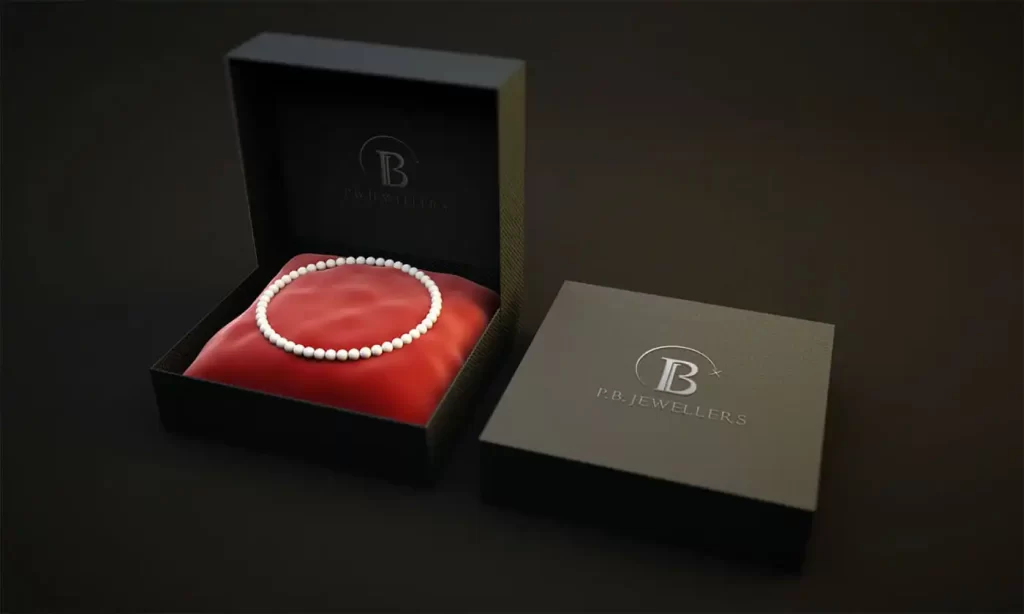
- Logo Design: APH incorporated the initials “PB” by intertwining them in a seamless manner. This approach symbolized unity, collaboration, and the harmonious blend of PB Jewellers’ craftsmanship with the aspirations of their clients. The overlapping initials also created an bespoke sign, representing the timeless nature of their designs.
- Icon Design: A sun rising crown effect with a gilded stroke ending in a spark was added on top of the intertwined initials. This crown symbolized PB Jewellers’ status as a shining star in the industry, while the spark represented the spark of creativity and innovation in their custom designs. The beautiful stroke added a touch of opulence and highlighted the brand’s commitment to excellence.
- Wordmark: The wordmark was placed below the icon to provide a clear representation of the brand name. The choice of a minimal and elegant typeface complemented the luxurious feel of the logo, while ensuring legibility and timeless appeal.
Outcome
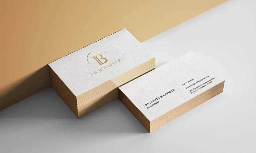
The collaboration between PB Jewellers and APH resulted in a visually stunning logo and brand identity that successfully captured the essence of the brand. The metallic finish logo and foil printing on brand collaterals created a gilded effect, elevating the overall luxurious appeal. The bespoke design, amaze finish, and custom design elements were reflected in every aspect of the brand identity, establishing PB Jewellers as a symbol of elegance and craftsmanship in the industry.
With their new logo and brand identity, PB Jewellers gained increased recognition and appeal among designers and customers alike. The combination of minimalism and opulence created a unique visual identity that set them apart from their competitors. The gilded effect and meticulous attention to detail showcased their commitment to quality and excellence, solidifying their position as a leader in the gold jewellery industry.
Conclusion
In conclusion, the collaborative effort between PB Jewellers and APH resulted in a logo and brand identity that truly redefined radiance, capturing the essence of bespoke designs, amaze finish, and the luxurious world of PB Jewellers.