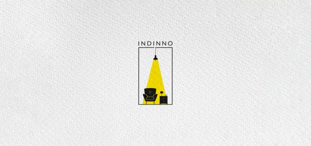
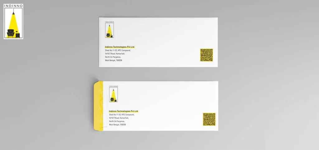
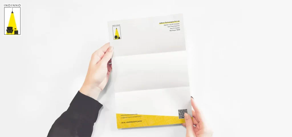
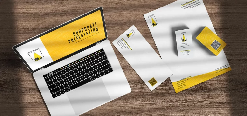
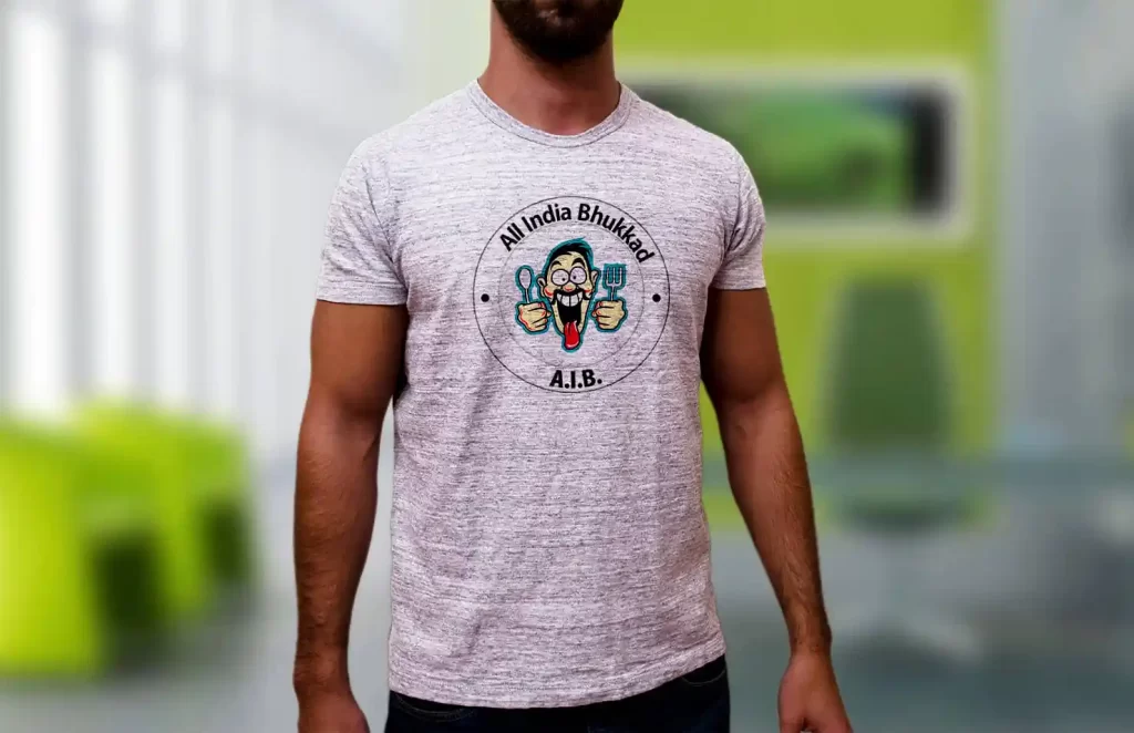
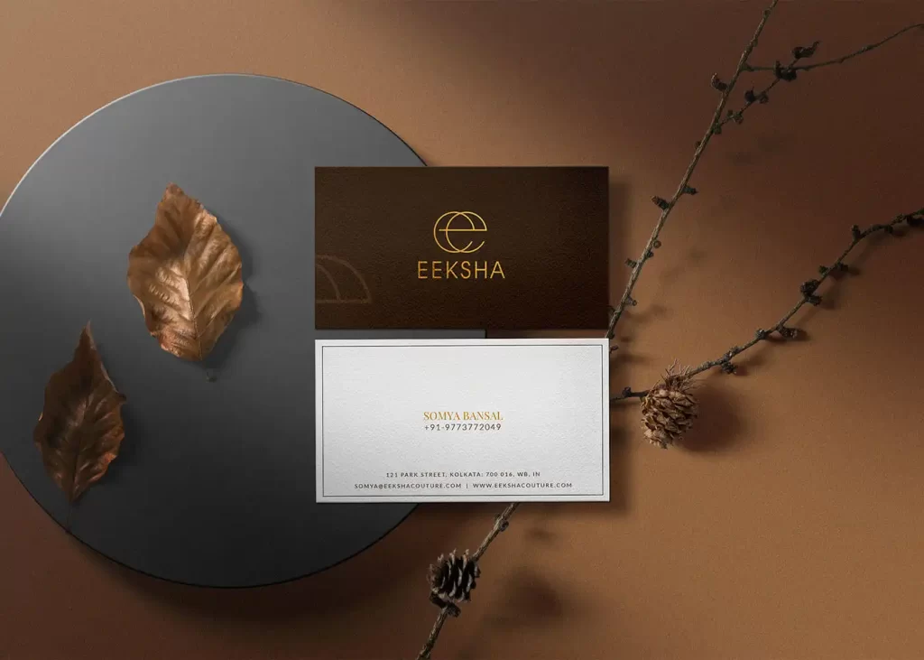
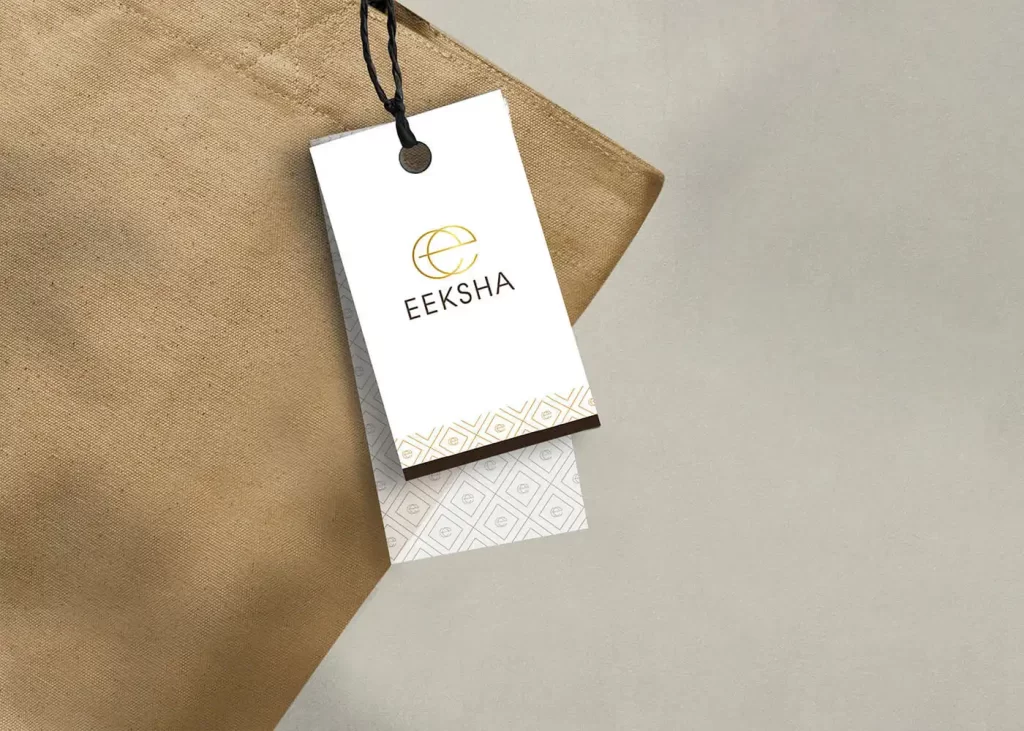
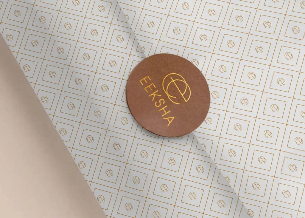
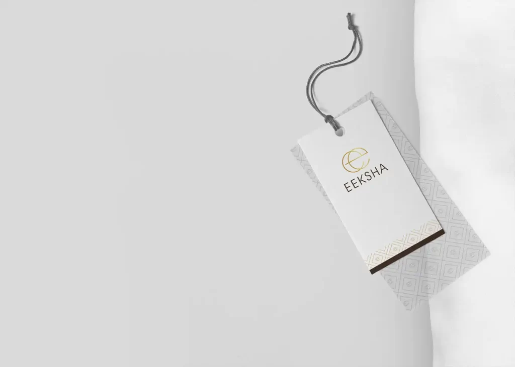
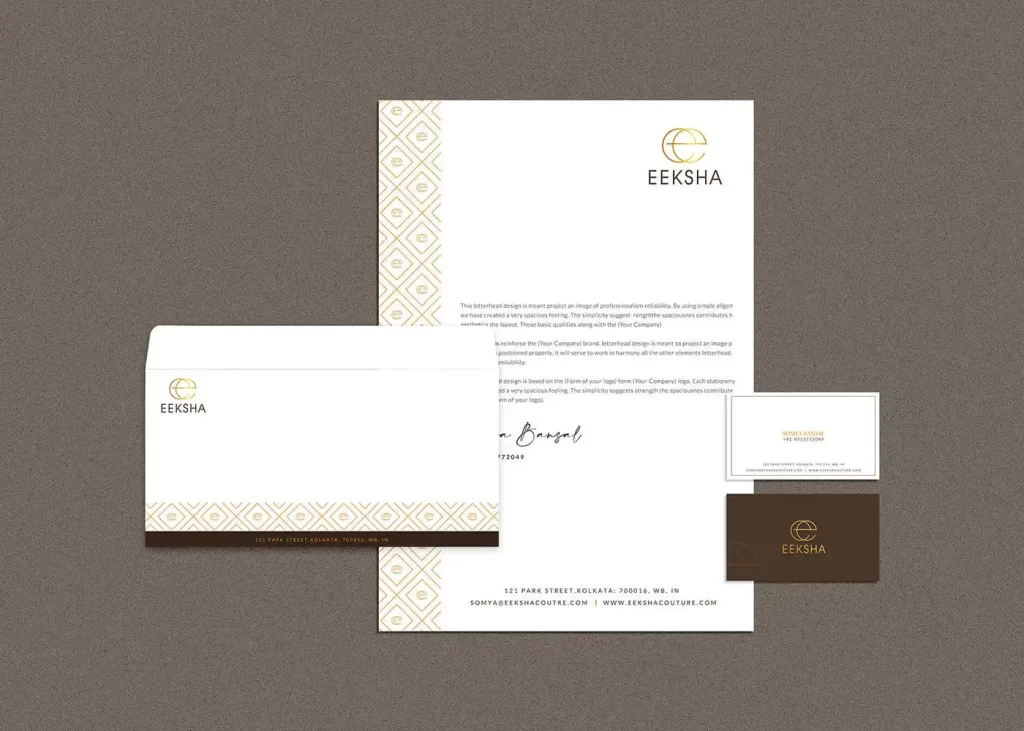
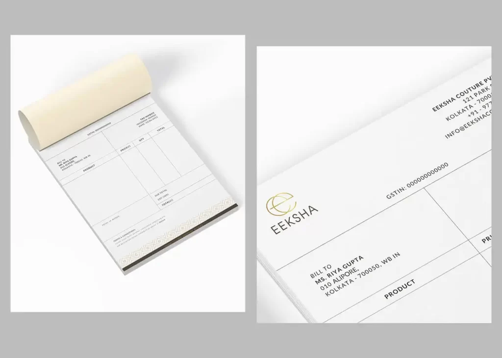
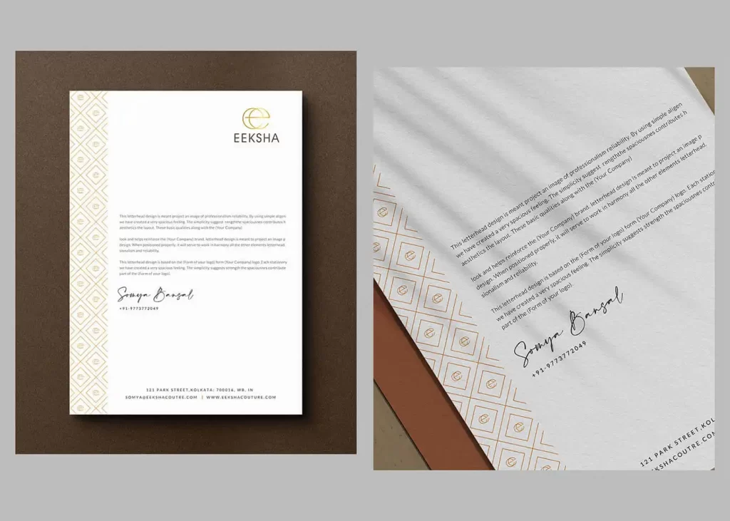
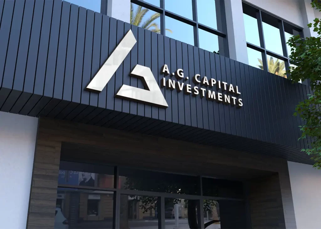
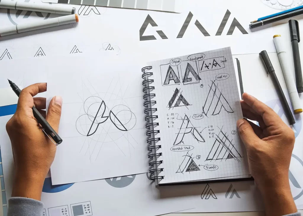
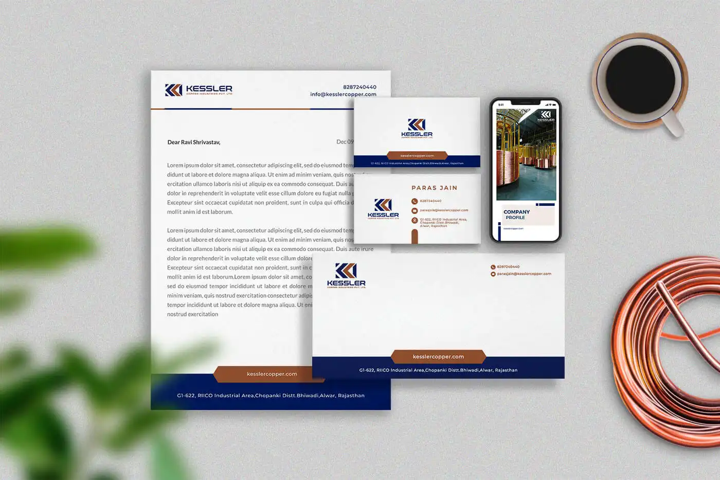
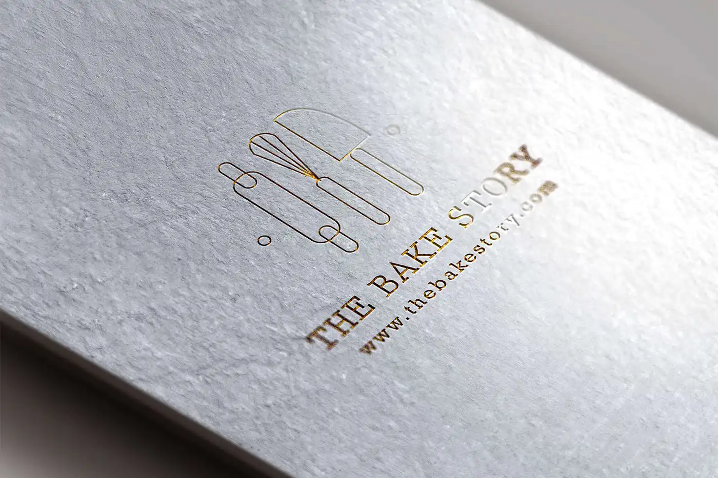
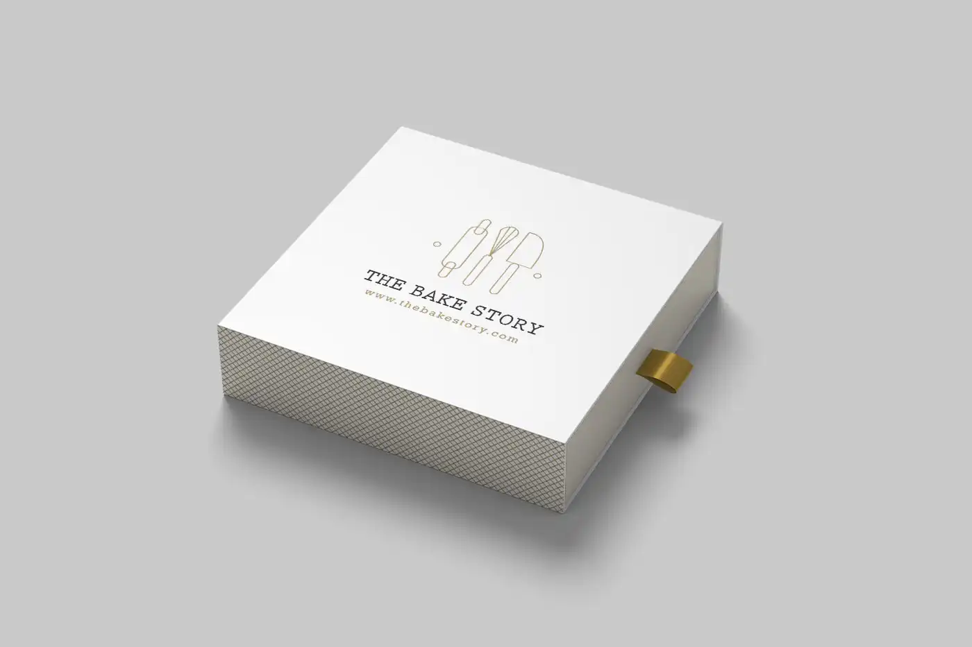
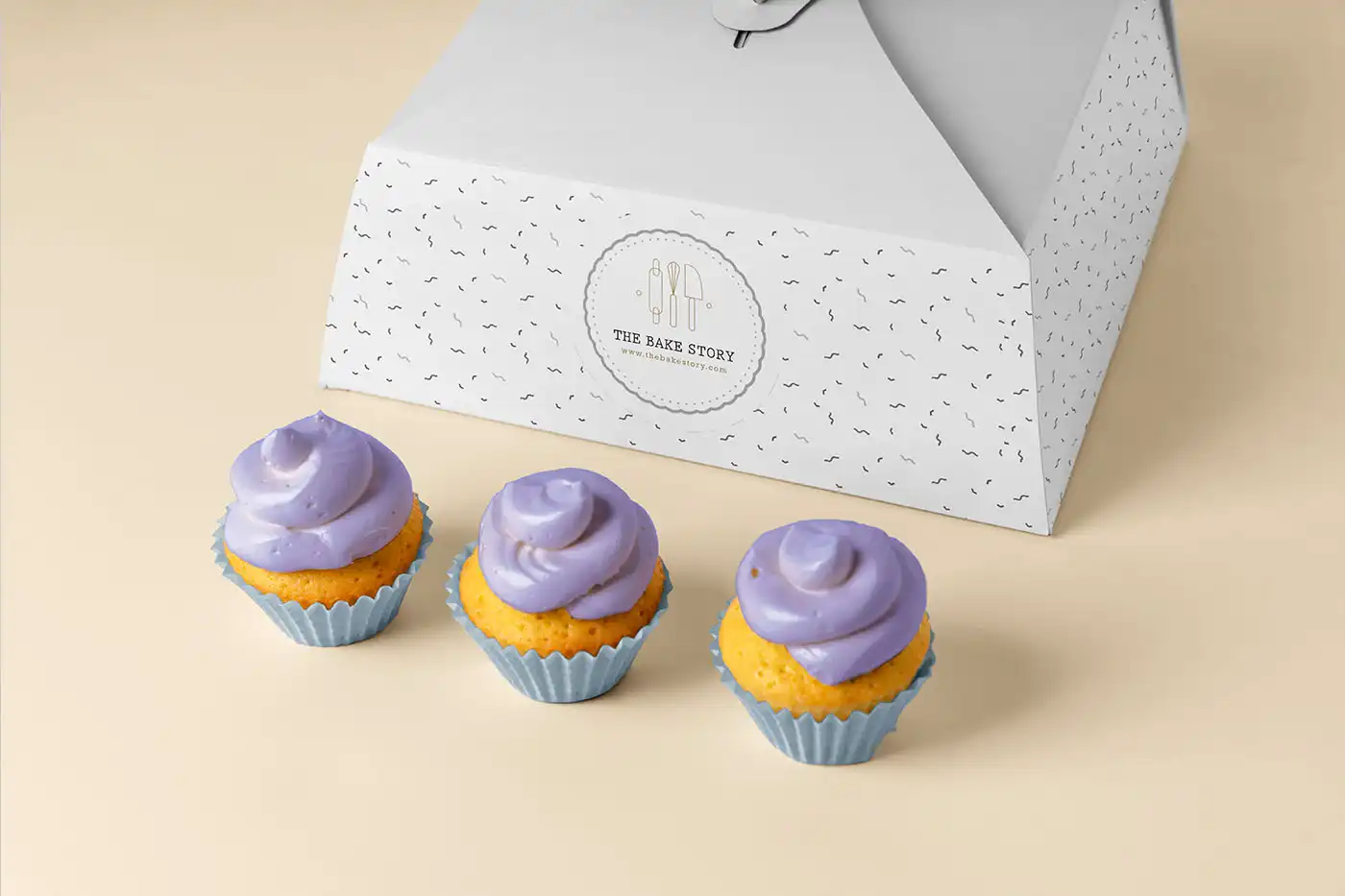
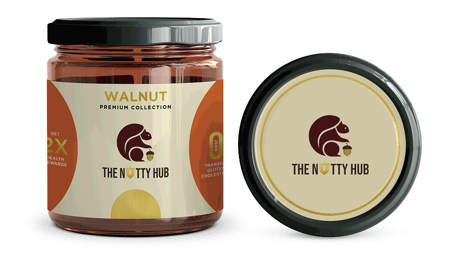
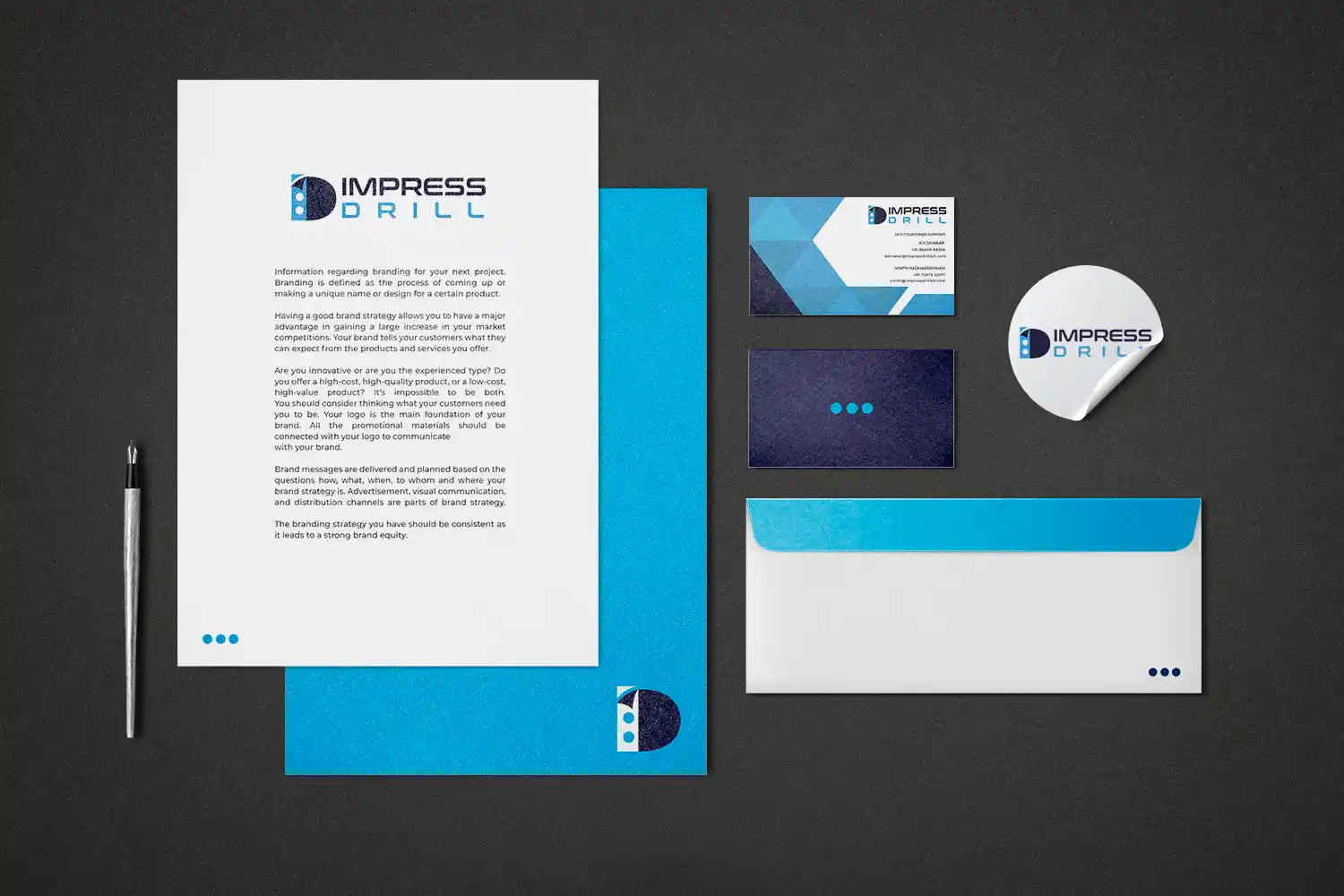
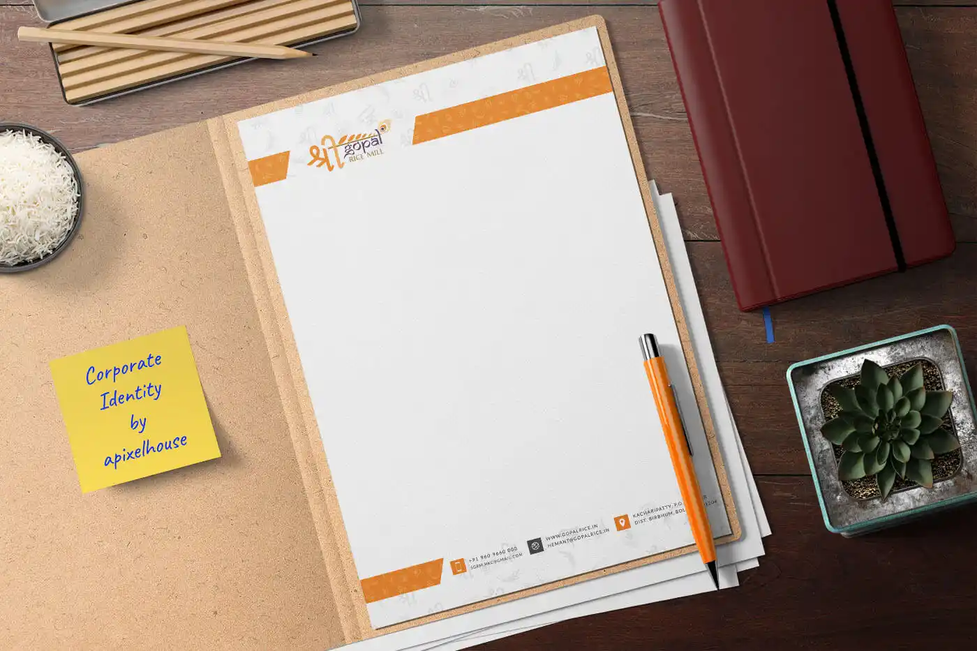
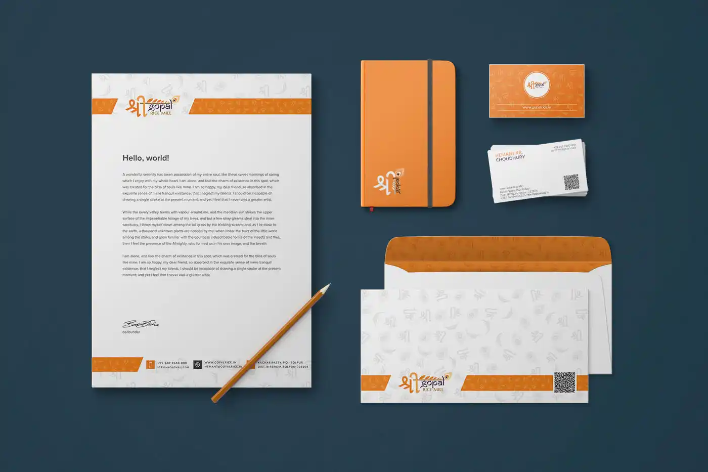
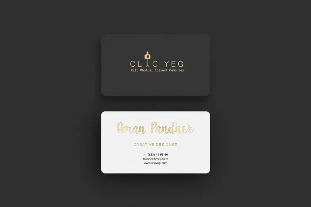
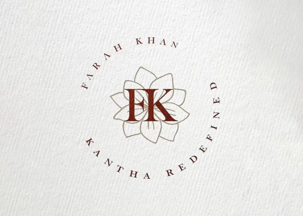
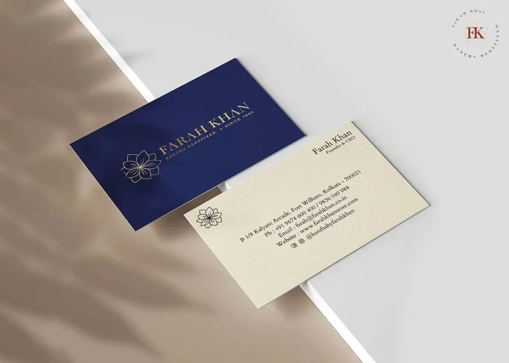
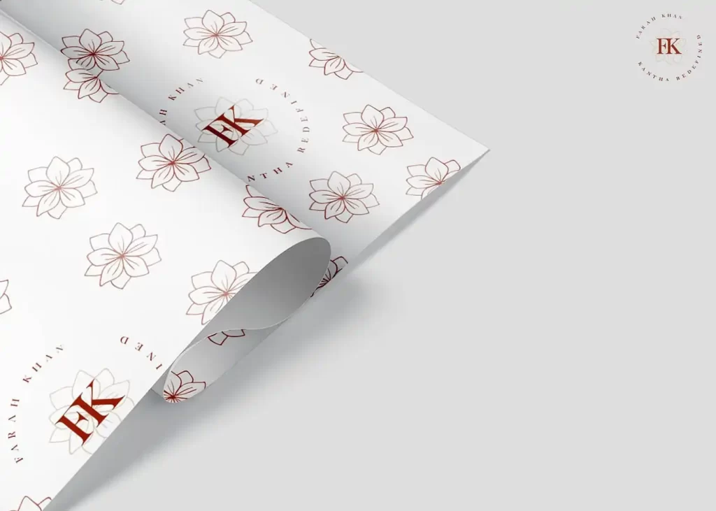
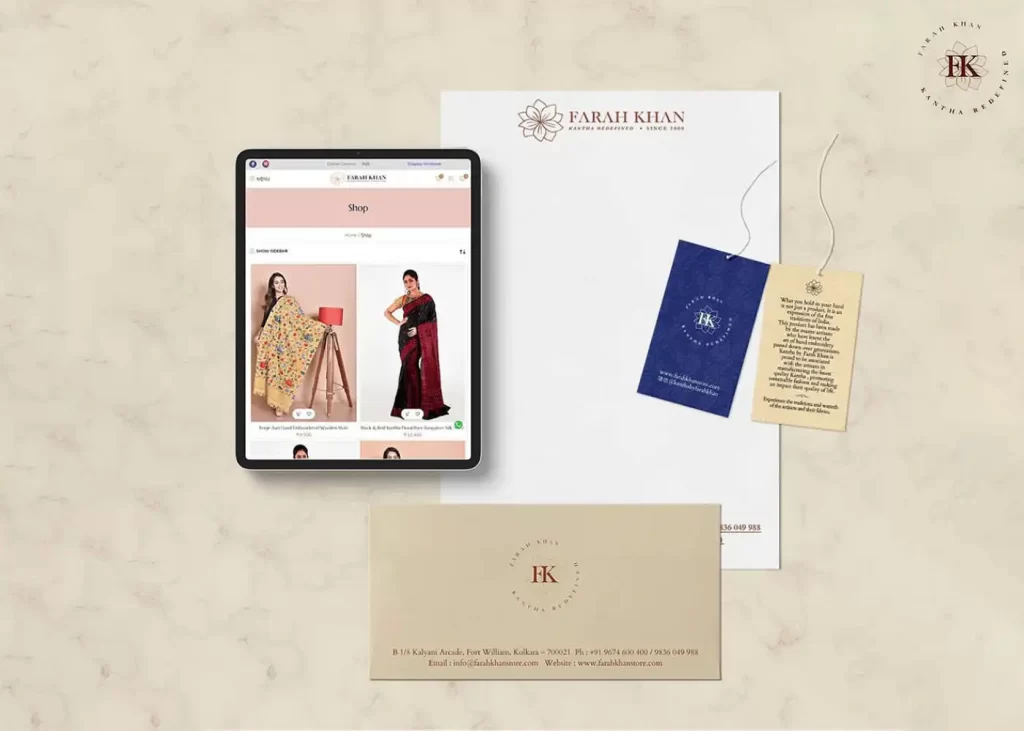
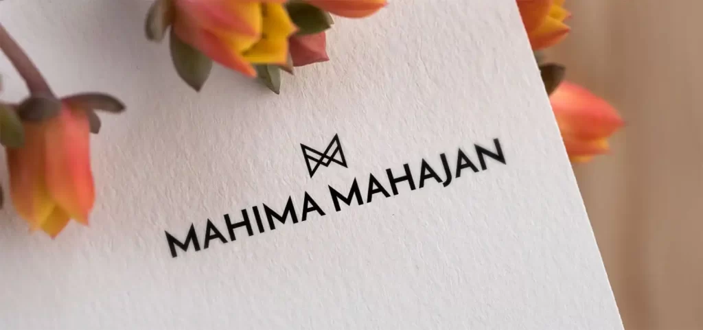
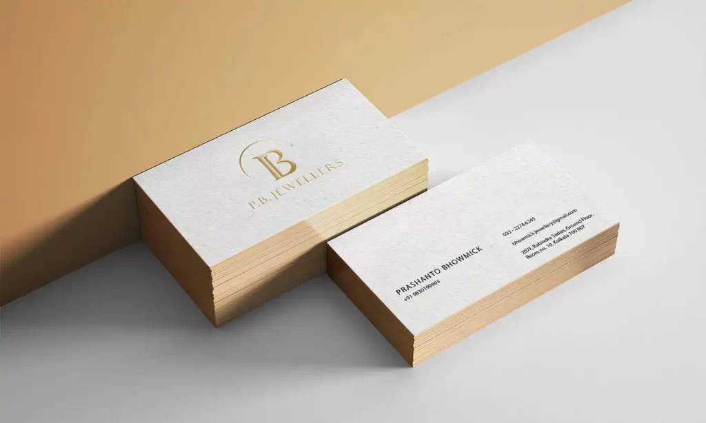
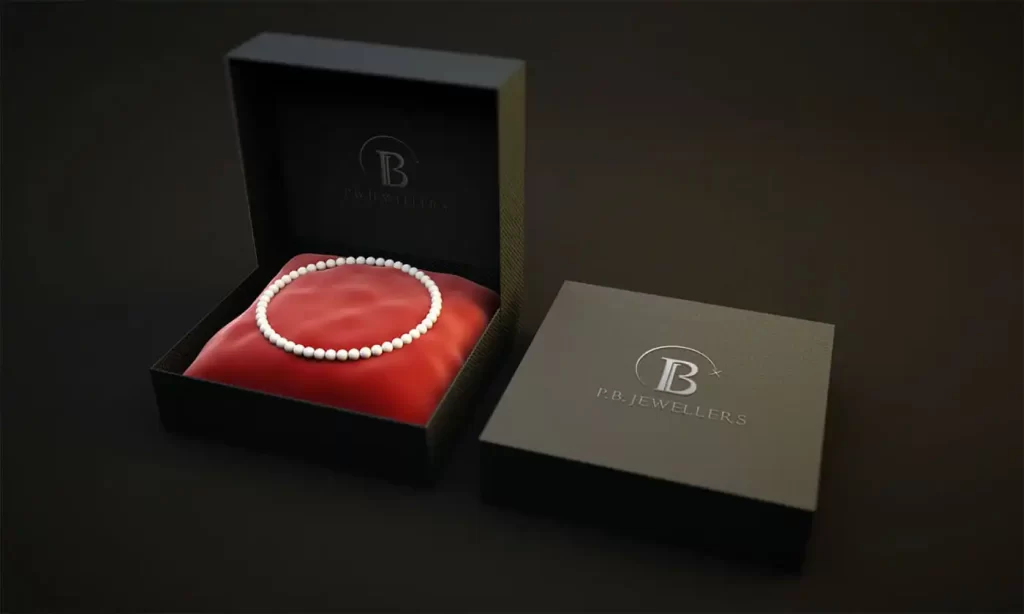
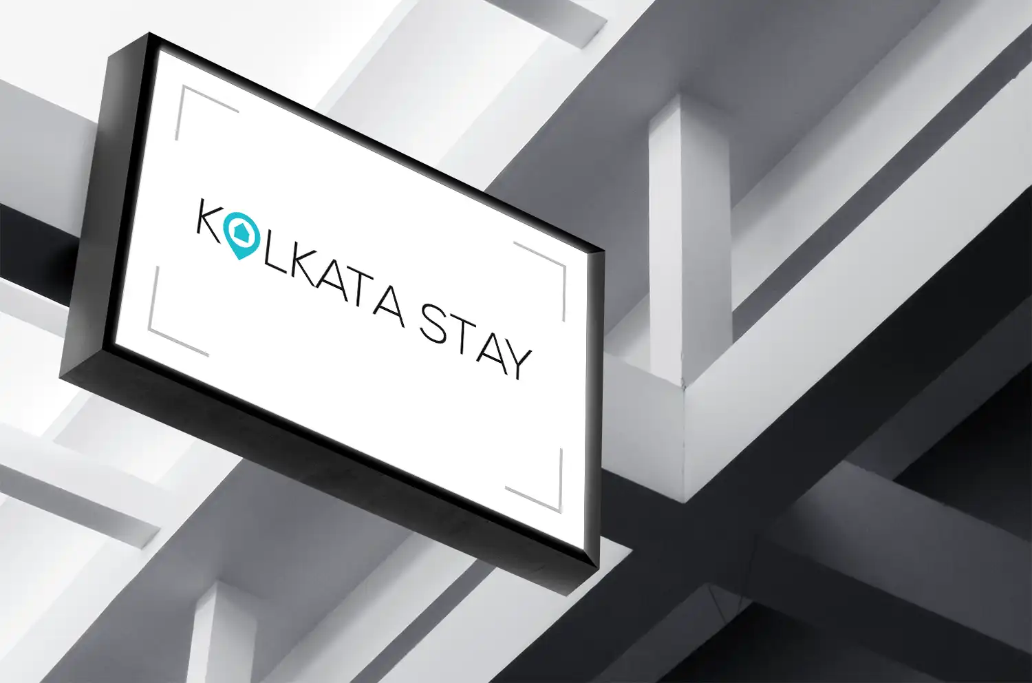
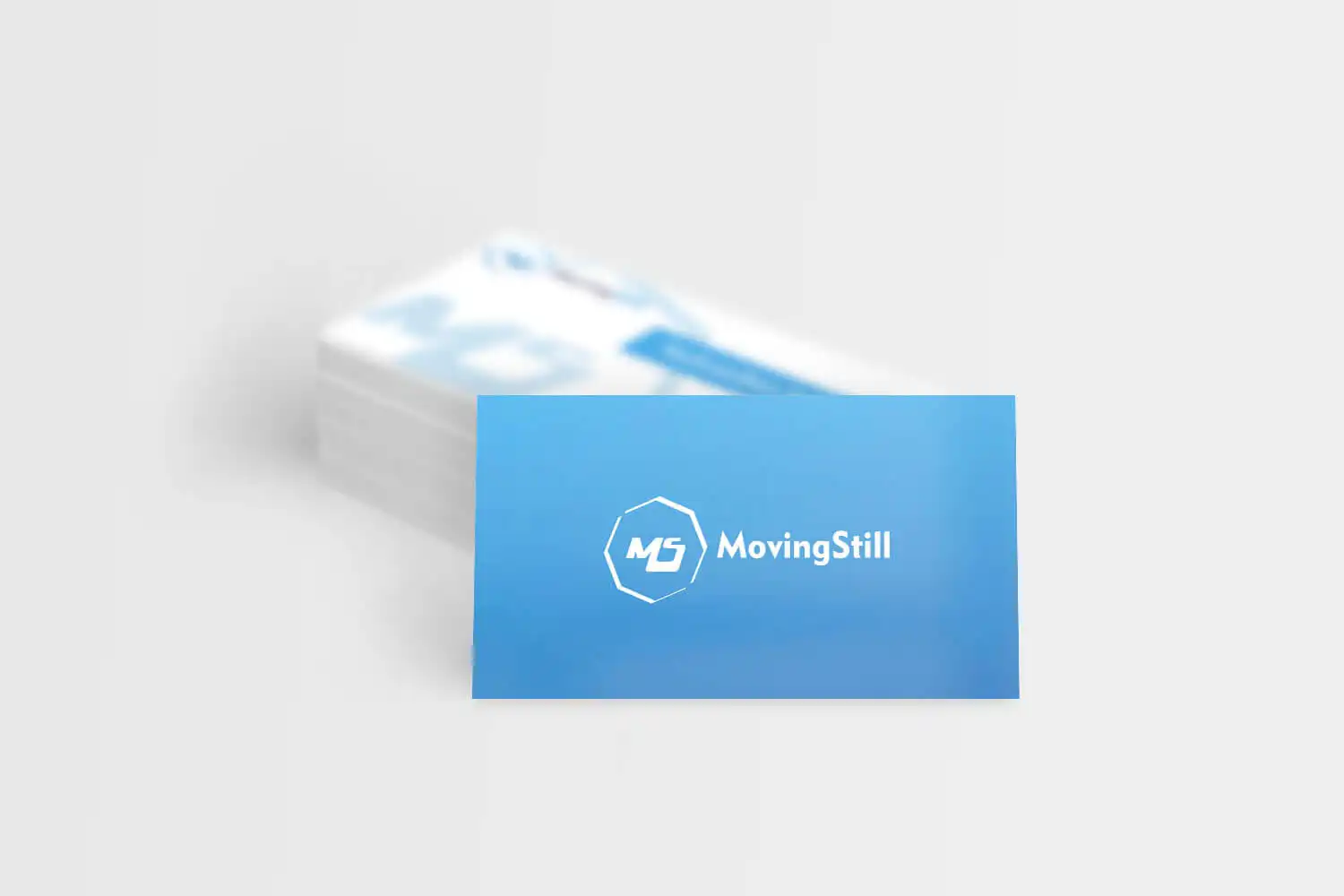
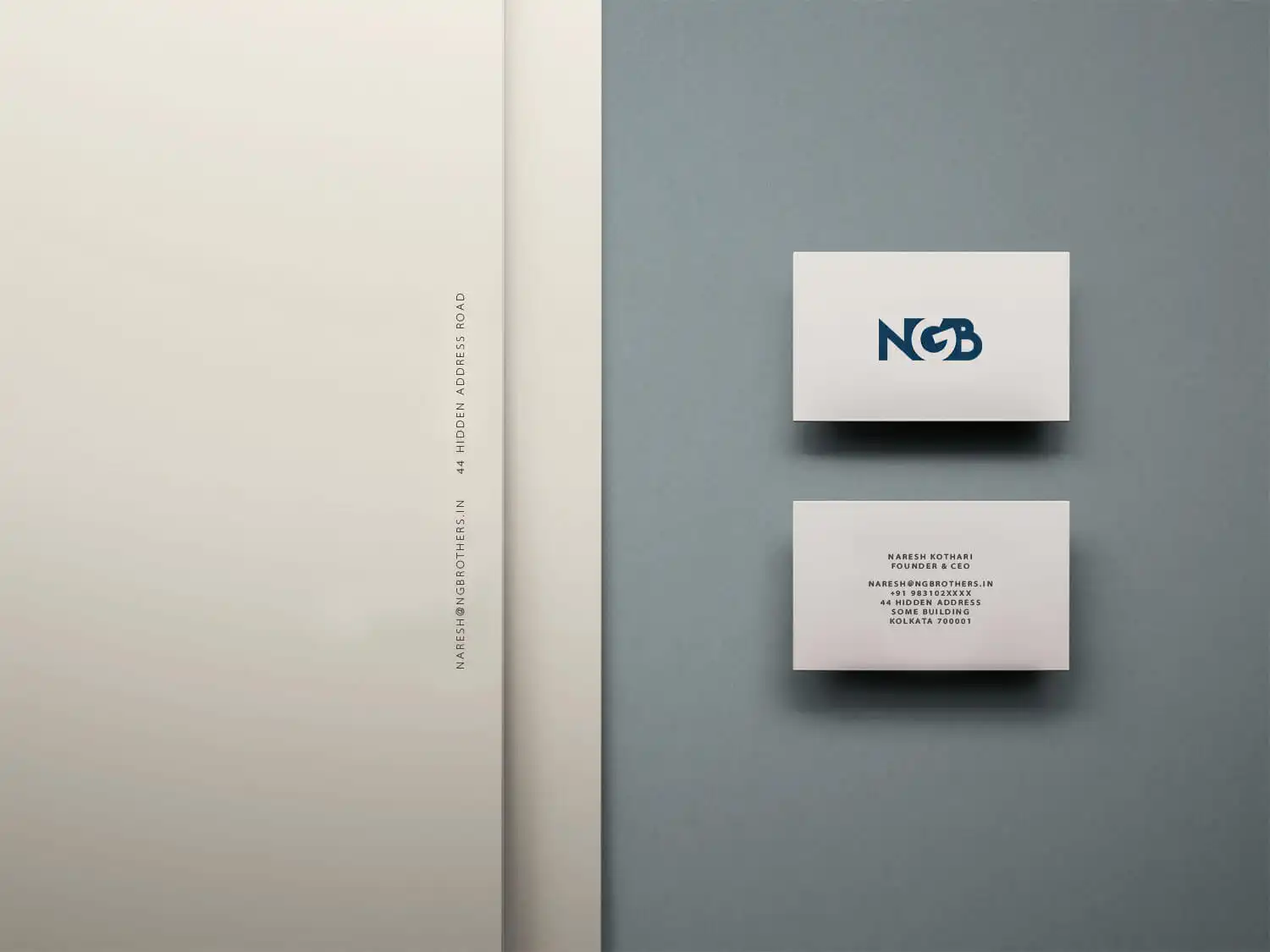
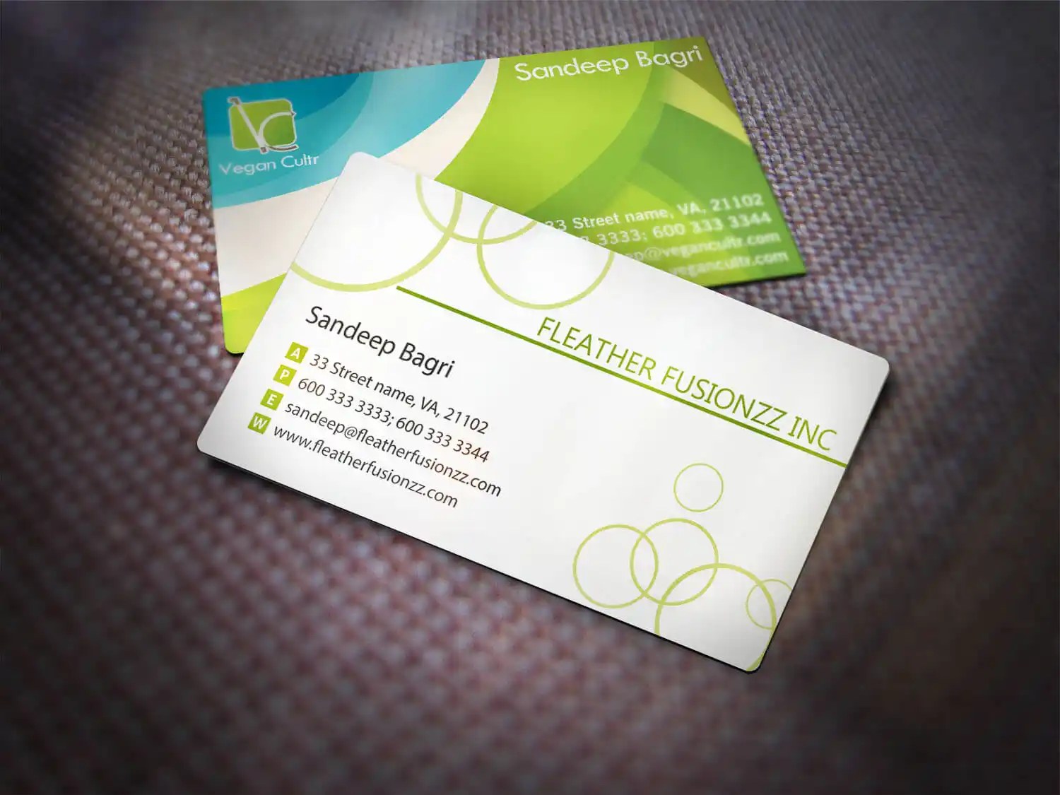
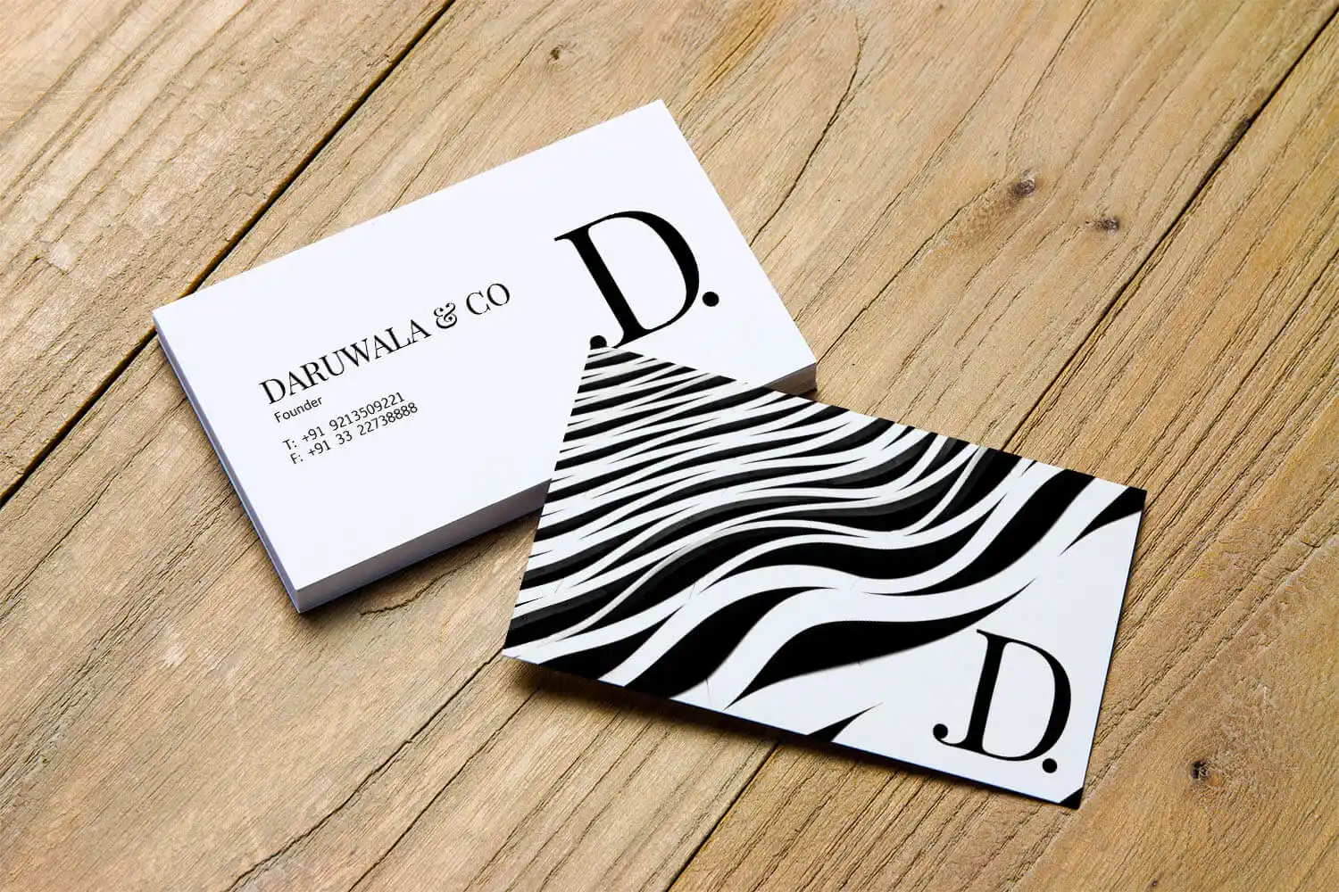
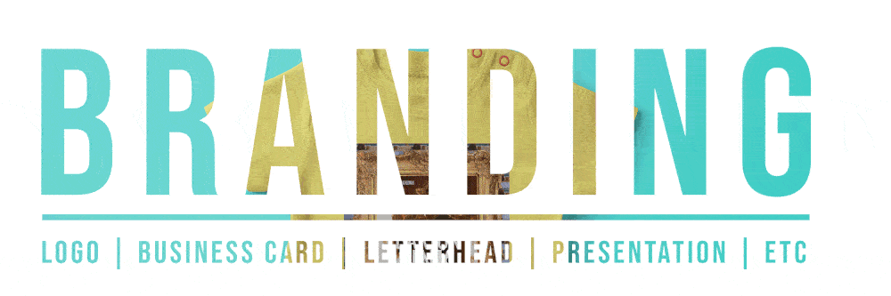
Logo & Brand Identity

Handcrafted logos, illustrations and artwork that kicks awesome! We create fully considered identity suites that are as unique and idiosyncratic as the individuals we design them for. Through logo design and corporate identity branding, we help shape how people see an organization.

0 +
Logo Designs
0 +
Clients
0 +
Years Expertise
0 +
Transformative Experiences

the ‘akok’ logo features a clean and bold typeface that exudes a sense of efficiency and beauty. The letters “AK OK” are designed with strokes of near-even weight, reflecting a harmonious balance and a strong sense of design. The boldness of the typography emphasizes the brand’s confidence and determination. It incorporates subtle references to Indian and international influences, symbolizing the fusion of cultures that AK OK celebrates. The logo’s simplicity and clarity allow it to adapt seamlessly across various platforms and applications, ensuring consistent brand recognition.

The Indinno logo captures the essence of the brand’s ethos through a thoughtfully designed imagery and minimal wordmark. The logo features a silhouette of a rectangular box, symbolizing structure and precision, with a suspended light bulb hanging from the ceiling. This imagery represents the fusion of craftsmanship and innovation that defines Indinno’s products. 

The task at hand was to whip up a logo that could tantalize taste buds, tickle the funny bone, and become an instant hit. We needed to find the perfect recipe for a visually stunning design that would capture the essence of the brand, leaving a mouthwatering impression on every hungry soul who laid eyes on it. It was time to bring out the big guns and create a logo that would have foodies drooling and craving for more!

The Eeksha Couture logo unit is a visual representation of the brand’s essence and values. It features a unique emblem that captures the spirit of the brand. The emblem showcases two elegantly intertwined letter “e’s,” symbolizing unity, continuity, and the interconnectedness of timeless beauty and craftsmanship. The logo unit communicates the brand’s commitment to excellence and its ability to seamlessly blend tradition with contemporary aesthetics.

AG Capital, a renowned financial services conglomerate with over 20 years of expertise, sought to elevate its brand identity and establish a powerful visual representation.The sleek, cobalt blue design exudes a sense of stability and reliability, echoing AG Capital’s expertise in the financial industry. The icon’s unique feature—a slanting line in the letter “A”—symbolizes the institution’s commitment

The logo for Kessler Copper Industries Pvt. Ltd. effectively communicates the company’s focus on advanced technology and manufacturing excellence through its design. The use of copper tones further emphasizes the company’s focus on robust offerings.

The brand identity of the copper wire manufacturing company is designed to convey strength, innovation, and reliability through a bold and sharp visual icon paired with a modern and straightforward sans-serif font that supports the brand’s confident and innovative personality.

Powerful and effective, we create graphics that communicate in a simple yet succinct manner. Using innovative communication channels and tools, we bring our clients’ brands to life through powerful and memorable expressions. We create distinctive visual content that engages audiences and forges strong brand connect.

With intense competition and saturated beauty industry, Elite Beauty needed a distinctive logo and brand identity that would differentiate them from established competitors and attract potential customers. Simple typography speaks loud enough about the brand story that needs to convey beauty aesthetics. Join us on an inspiring journey as we dive into the details of this captivating logo design and the impact it has had on Elite Beauty’s brand identity.

As a new entrant into the market The Nutty Hub brand stood out with its elegant packaging, transparent approach, and emphasis on quality and health. By combining creativity, research, and a passion for design, APH enabled Nutty Hub to establish a strong presence and build a loyal customer base. The collaboration exemplifies the power of strategic branding and design in transforming a vision into a compelling brand experience.

IAM Consultancy, a young and dynamic education consultancy, was founded by two passionate individuals who aimed to provide comprehensive support and guidance to students aspiring to study abroad. APH partnered with IAM Consultancy to develop a captivating brand identity that would set them apart from traditional education consultancies. The key objective was to create a logo and brand identity that would reflect the consultancy’s focus on student empowerment, intelligence, and the importance of individuality.

Impress Drill’s new brand identity positions them as a reliable and innovative provider of high-quality paper drill bits. The cohesive branding elements, including the logo, color palette, and font, contribute to a strong brand presence across various touchpoints, including the company’s website and marketing materials. How could APH design a brand identity that would communicate Impress Drill’s commitment to precision and cutting-edge technology while visually capturing the essence of their products and services?

As the largest obstacle challenge race in Eastern India, 10Tackles sought a captivating logo that would embody the spirit of adventure and convey the physical and mental challenges participants would face. The dynamic logo icon featuring a man jumping over an obstacle inside a hexagon-shaped element instantly communicates the excitement and intensity of the race. The rugged look and brownish-red color palette evoke a sense of adventure and ignite participants’ enthusiasm.

The logo for Vansh Gems was meticulously crafted to reflect the brand’s core values and the exceptional craftsmanship that defines their jewellery pieces. APH designers incorporated a modern and minimalist approach, focusing on a sleek and sharp logo design. The letter “V” formed the foundation of the logo, with the letters “V” and “G” intricately intertwined within it, resembling a gem. The bold and angular lines conveyed a sense of strength and sophistication, while the black color palette added a touch of opulence and exclusivity.

APH designed a logo that blended Hindi and English elements to create a harmonious representation of Gopal Rice Mill’s values. The logo prominently featured the word “Shree” in Hindi, at the end of the logo, a peacock feather, reminiscent of Lord Krishna (Gopal), was incorporated, adding a touch of divinity to the design. The extended line from the word “Shree” subtly resembled Krishna’s flute, further reinforcing the brand’s connection to tradition and spirituality.

Crafting a Golden Brand Identity for Canada’s Premier Open-Air Photobooth. The collaboration between CLIC YEG and APH resulted in a captivating logo that encapsulated the brand’s sleekness, professionalism, and commitment to creating memorable experiences. 


Kantha by Farah Khan, a brand specializing in handcrafted Kantha products, approached APH to refine their existing logo and create a cohesive brand identity. They were dissatisfied with the work done by a previous agency and sought APH’s expertise to enhance their visual representation. APH undertook a meticulous approach to refine the logo and develop a cohesive brand identity for Kantha by Farah Khan. Discover how we did it:

Discover how APH transformed the logo for renowned Indian fashion icon, Mahima Mahajan, capturing the essence of her whimsical designs and merging Indian fondness with Western silhouettes. The challenge was to design a logo that encapsulated Mahima Mahajan’s whimsical and functional approach to fashion, while incorporating elements that showcased the fusion of Indian and Western styles.

PB Jewellers faced the challenge of standing out in a competitive market saturated with traditional gold jewellery brands. They wanted a logo that would not only showcase their custom designs and impeccable finishing but also exude a sense of opulence and elegance. It was crucial to strike the right balance between luxury and minimalism to appeal to their target audience of discerning customers and other designers. Unveil how we achieved it: 

Janata Textile, a renowned retailer in the furnishing industry, sought to revamp their logo to reflect their commitment to quality, innovation, and staying up-to-date with the latest fashion trends. With a rich history spanning three generations, they wanted a logo that would blend their legacy with a contemporary and modern look. They approached APH to create a new logo that would embody their values and showcase their expertise in the industry.

After careful consideration and collaboration with the client, APH crafted a logo that combined a captivating motif with the brand initials, capturing the essence of luxury and wanderlust. The motif, carefully designed with intricate details, represented the harmonious fusion of travel and weddings. The bold and elegant typography of the brand initials added a touch of sophistication and professionalism.

The minimal and light typography, combined with the location pin balloon icon, effectively conveyed the brand’s trustworthiness and emphasized its strategic location. The monochrome color scheme with the touch of blue added a touch of sophistication and tranquility to the overall visual identity.

Moving Stills, a dynamic signage company, approached APH to create a distinctive brand identity. APH designed a visually stunning logo that embodies the concept of movement and stillness. The logo features a captivating combination of the brand initials “MS” enclosed within an abstract shape that represents both a still frame and the fluidity of motion. The logo’s monochrome color palette adds a touch of elegance and versatility.

APH created a unique logo that symbolizes Aswini Bajaj’s journey of success. While a shooting star was initially considered as a metaphor for his achievements, the final logo design deviated from it to capture his professional persona more effectively. The logo features his initials “A” and “B” in a stylized form, reflecting his expertise and passion for finance. The typography chosen for the initials exudes professionalism and credibility.

Through collaboration with APH, WLCC successfully transformed its brand identity into a powerful representation of its values and expertise. The cohesive use of blue and grey colors, along with the carefully crafted “W” icon, conveyed a sense of trust, reliability, and strategic thinking; and the thoughtfully crafted wordmark, positioned WLCC as a leading consultancy firm.

Cartiquo, a revolutionary start-up founded by Yash Sanei, aimed to transform the automobile industry in India by creating a transparent and accessible cloud-based platform. The objective was to create a logo and brand identity that conveyed Cartiquo’s core values of luxury, transparency, and innovation. The brand needed to appeal to car enthusiasts and position Cartiquo as a premium and trustworthy platform in the automobile industry.

The project logo design successfully captured the essence of Shivam Stones’ brand identity. The circular emblem with the intertwined S’s symbolized unity, completeness, and their commitment to delivering quality paving stones. The bold and clean wordmark below the emblem conveyed professionalism and highlighted the brand’s global reach.

The final logo design perfectly captured the brand identity of TWD – The Wedding Diaries. The use of pink color, the heart-shaped icon, and the ornate crown pattern evoked a sense of romance, luxury, and bespoke experiences. The color palette chosen for the logo was predominantly pink, symbolizing love, passion, and femininity.

After a thorough exploration of design concepts, we crafted a new logo that perfectly aligned with NGB’s requirements. The logo featured the initials “N,” “G,” and “B” merged together in a visually striking manner. The “N” was rendered in vibrant orange, representing energy and creativity. The “G” was designed in blue, symbolizing trust and reliability. The negative space between the “N” and “B” formed the letter “G,” representing precision and attention to detail.

The rounded square icon with the ligature of the initials inside conveyed the brand’s focus on vegan leather goods. The contrasting colors within the logo balanced the brand’s sustainability message with a touch of sophistication. The clean wordmark complemented the icon, providing a harmonious visual representation of Vegan Cultr’s commitment to ethical and stylish fashion.

From exquisite residential interiors to awe-inspiring commercial projects, they bring innovation and creativity to every endeavor.  Our partnership with Daruwala & Co has resulted in a remarkable monochrome masterpiece that exudes strength and sophistication. With a bold 3D pattern in black and white, we have brought their vision to life, capturing the essence of transformative design.

Be the first to get our newsletters

We won’t spam, promise!