Kantha by Farah Khan, a brand specializing in handcrafted Kantha products, approached APH to refine their existing logo and create a cohesive brand identity. They were dissatisfied with the work done by a previous agency and sought APH’s expertise to enhance their visual representation.
Complication:
The existing logo did not effectively capture the essence of Kantha by Farah Khan and lacked a distinctive visual identity. The brand needed a refined logo and a complete brand identity system to align with their authentic, handcrafted products and showcase their unique approach to Kantha.
Question
How can APH enhance the logo and create a comprehensive brand identity that accurately represents the essence of Kantha by Farah Khan and differentiates them in the market?
Answer
APH undertook a meticulous approach to refine the logo and develop a cohesive brand identity for Kantha by Farah Khan. The process involved the following steps:
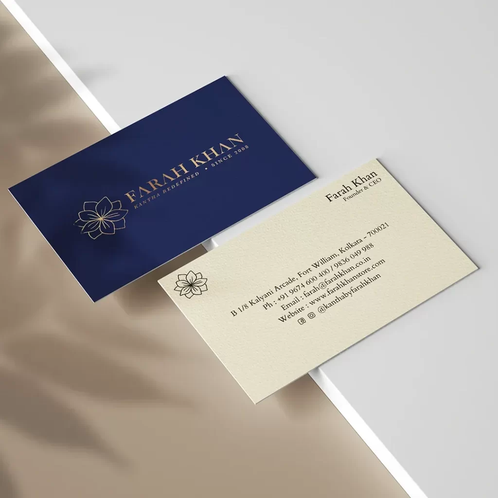
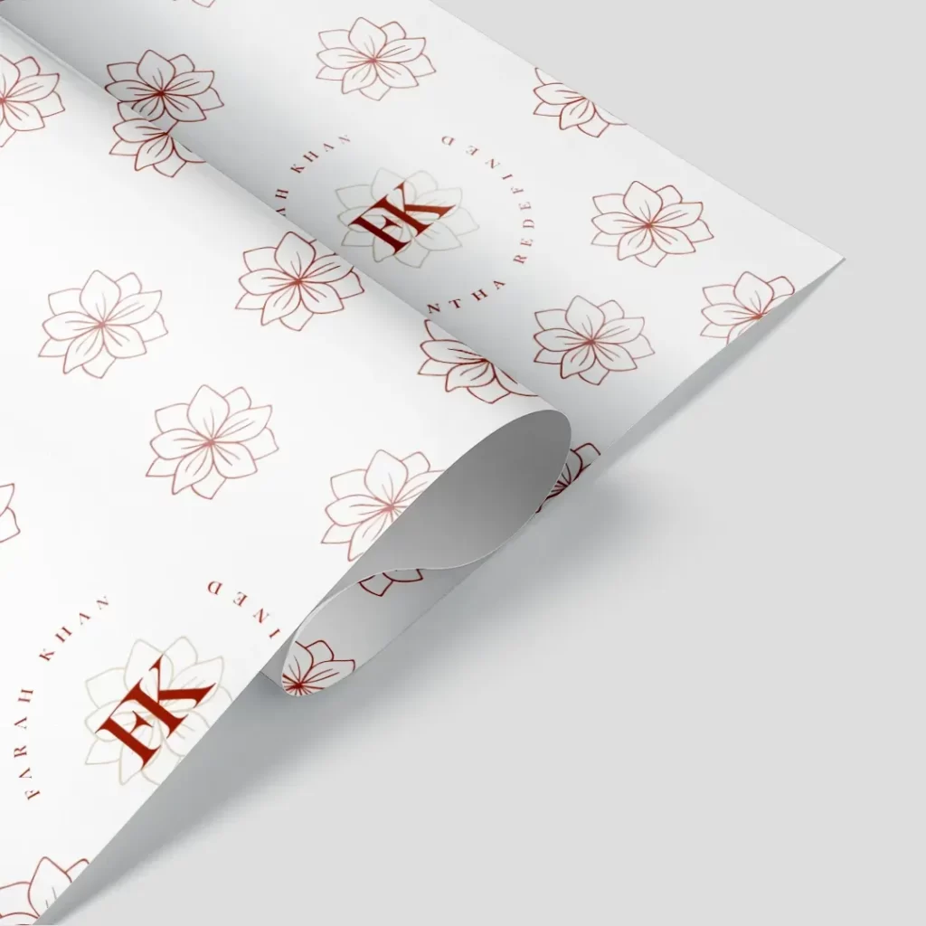
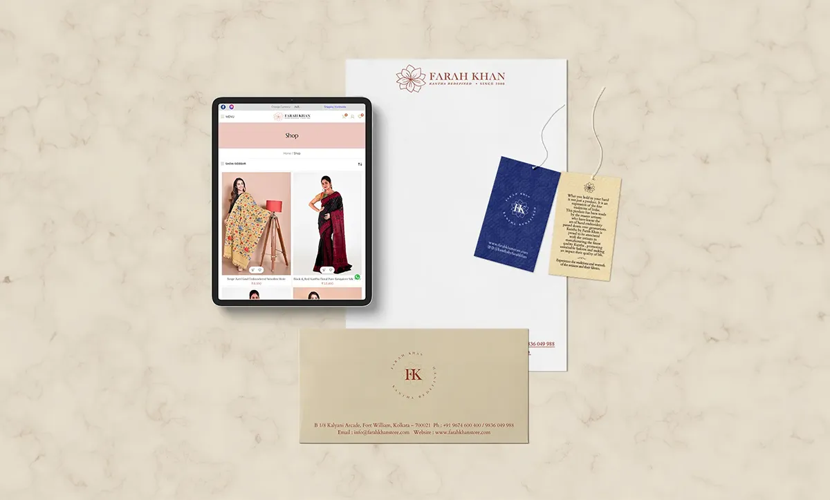
- Logo Finishing and Color Selection: APH collaborated closely with the brand to fine-tune the logo design. The focus was on capturing the essence of Kantha and the brand’s commitment to preserving traditional craftsmanship. The color palette was carefully selected, with a primary color of golden to evoke warmth, elegance, and authenticity.
- Brand Collaterals: APH extended the brand identity beyond the logo, creating a range of brand collaterals to ensure consistency and cohesiveness. This included designing a visually appealing visiting card, price tags, company profile notes, letterheads, envelopes, bill books, printer sheets, and paper bags in two sizes. Each collateral was crafted with attention to detail and aligned with the brand’s aesthetic.
- Embracing Authenticity: APH’s design approach emphasized the imperfection and uniqueness of Kantha by Farah Khan’s handcrafted products. The logo featured a flower icon with the brand initials overlapping in the center, symbolizing the blend of tradition and contemporary flair. An emblem-like border highlighted the brand’s dedication to redefining Kantha, creating a strong visual representation of their ethos.
- Crafting a Limited-Edition Experience: APH aimed to convey the exclusivity and artistic value of Kantha by Farah Khan’s products. The brand identity portrayed each piece as a standalone work of art, never to be replicated, worthy of being passed down as an heirloom. The refined logo and brand identity captured this essence, connecting emotionally with customers who appreciate the value of handcrafted, limited-edition pieces.
Outcome
Outcome: APH’s efforts resulted in a successful transformation of Kantha by Farah Khan’s logo and brand identity. The refined logo, with its harmonious blend of tradition and contemporary elements, accurately represented the brand’s commitment to preserving Kantha craftsmanship. The comprehensive brand identity system, including various collaterals, conveyed a cohesive and authentic visual language, resonating with the brand’s target audience. Kantha by Farah Khan was able to establish a stronger brand presence, differentiate themselves in the market, and showcase the unique artistry behind their handcrafted Kantha products.