Gopal Rice Mill, a renowned organization in the rice industry, had been delivering a wide range of high-quality rice products since its inception in 1955. With a strong reputation as a manufacturer, supplier, exporter, and trader, Gopal Rice Mill wanted to establish a distinct brand identity and expand its presence in the competitive market. They sought a logo and brand identity that would reflect their legacy, commitment to quality, and organic approach.
Complication
Gopal Rice Mill faced the challenge of transforming its primarily B2B model into a recognizable B2C brand. They needed a visual identity that would resonate with consumers, communicate the premium quality of their rice products, and differentiate them from competitors. Additionally, they desired a logo that encapsulated their rich heritage and organic farming practices.
Question
How could APH help Gopal Rice Mill create a unique and symbolic logo that would represent their legacy, quality, and organic nature, while appealing to the B2C market?

Answer
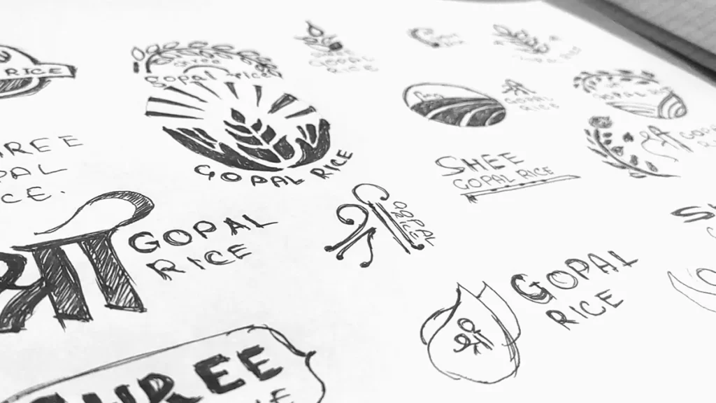
To address Gopal Rice Mill’s needs, APH embarked on a creative journey to design a logo and brand identity that would capture the essence of the brand and connect with consumers.

Solution
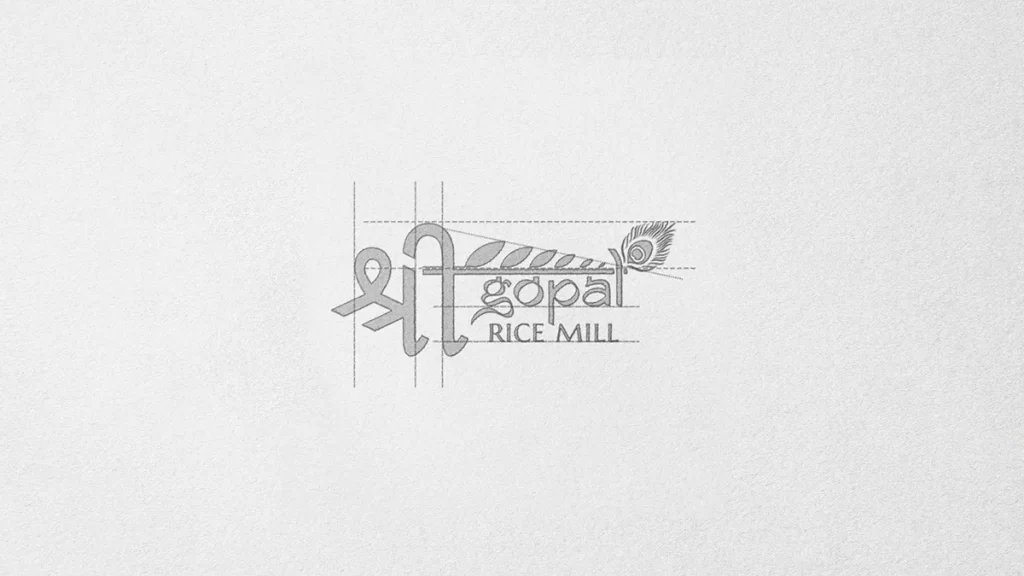
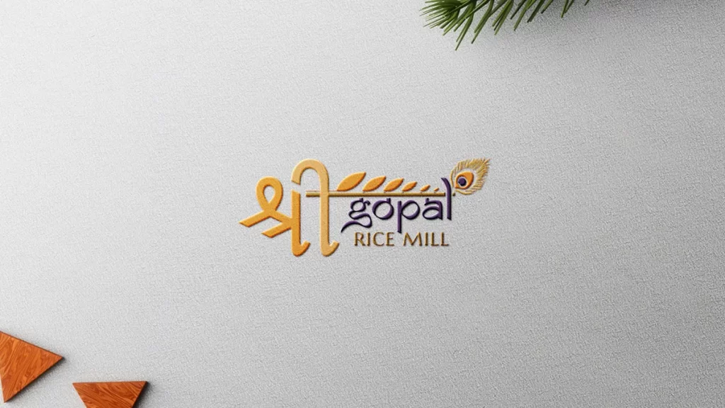
Logo Design: APH designed a logo that blended Hindi and English elements to create a harmonious representation of Gopal Rice Mill’s values. The logo prominently featured the word “Shree” in Hindi, adorned with leaves extending from the sleeping lines of the letters. These leaves symbolized the organic nature of the brand and their commitment to quality. At the end of the logo, a peacock feather, reminiscent of Lord Krishna (Gopal), was incorporated, adding a touch of divinity to the design. The extended line from the word “Shree” subtly resembled Krishna’s flute, further reinforcing the brand’s connection to tradition and spirituality.
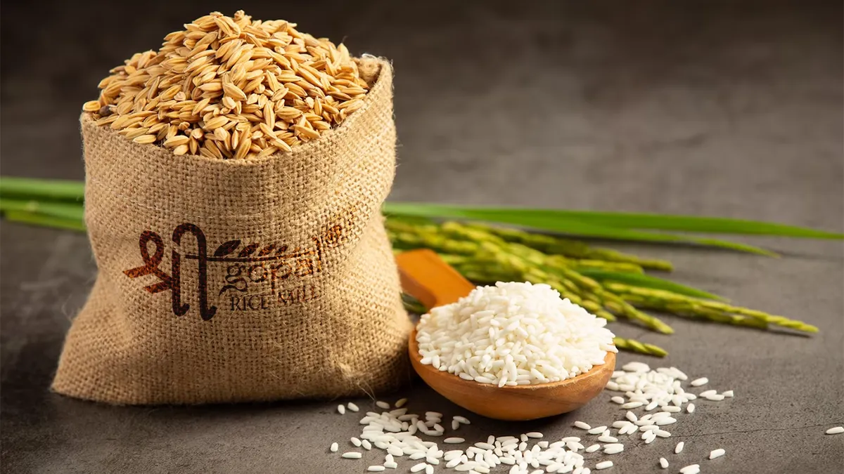
Color Scheme: The logo embraced a vibrant color scheme of orange and purple. Orange symbolized vitality, abundance, and the golden fields where the rice was grown, while purple added a sense of royalty and sophistication to the overall design.
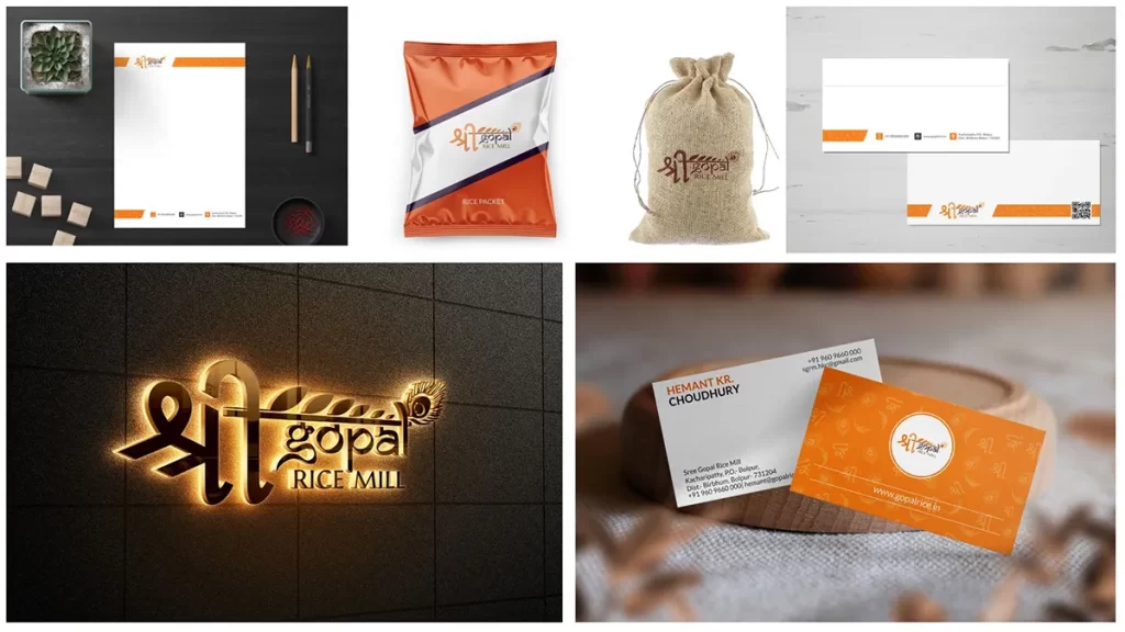
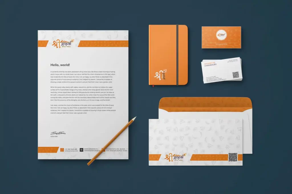
Brand Identity: APH extended the logo’s essence throughout Gopal Rice Mill’s brand identity collaterals. From elegantly designed business cards and letterheads to custom USB pendrives, every element showcased the brand’s commitment to quality, heritage, and organic farming practices.

Outcome
The collaboration between Gopal Rice Mill and APH resulted in a distinctive logo and brand identity that perfectly represented the brand’s legacy and values. The logo’s symbolic elements, blending tradition and modernity, resonated with the target audience, establishing an emotional connection and trust. The vibrant color scheme and cohesive brand identity collaterals further enhanced Gopal Rice Mill’s market presence and positioned them as a reliable and premium choice for rice products.
Through the new logo and brand identity, Gopal Rice Mill successfully transitioned from a primarily B2B model to a recognizable B2C brand. The logo’s symbolism, organic aesthetics, and representation of tradition appealed to consumers seeking high-quality rice products and reinforced Gopal Rice Mill’s position as a trusted name in the industry.
Overall, APH’s expertise in logo design and brand identity development allowed Gopal Rice Mill to elevate their brand presence, attract new customers, and carve a distinct niche in the competitive rice market.