Situation:
Kolkata Stay, a provider of fully serviced homestays in Kolkata, sought to create a brand identity that instilled trust and showcased the strategic location of their properties. They wanted a visual representation that resonated with families looking for a comfortable and connected stay experience. APH was entrusted with the task of designing a brand identity that effectively communicated these key aspects.
Challenges:
- Infusing trust: The brand needed to establish a sense of reliability and trustworthiness among potential guests.
- Highlighting location: Kolkata Stay’s strategic advantage of being within driving distance from major city touchpoints needed to be visually emphasized.
Solution:
To address these challenges, APH developed a brand identity that successfully captured the essence of Kolkata Stay’s unique offerings. The key elements of the solution were:
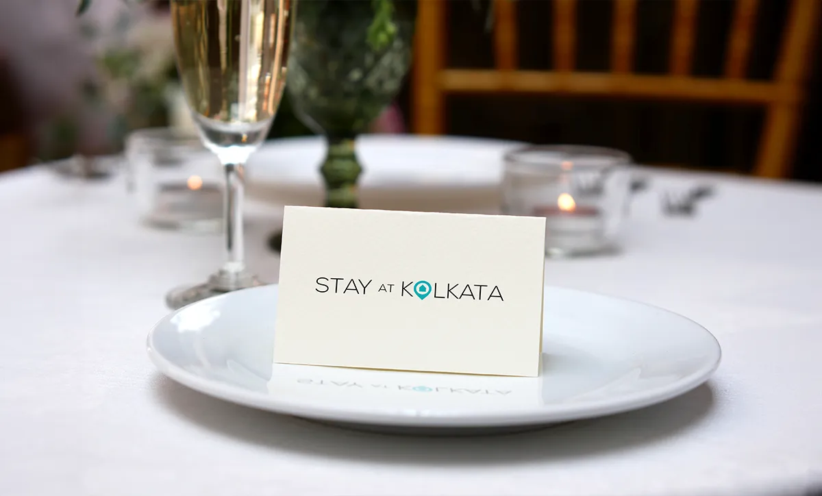
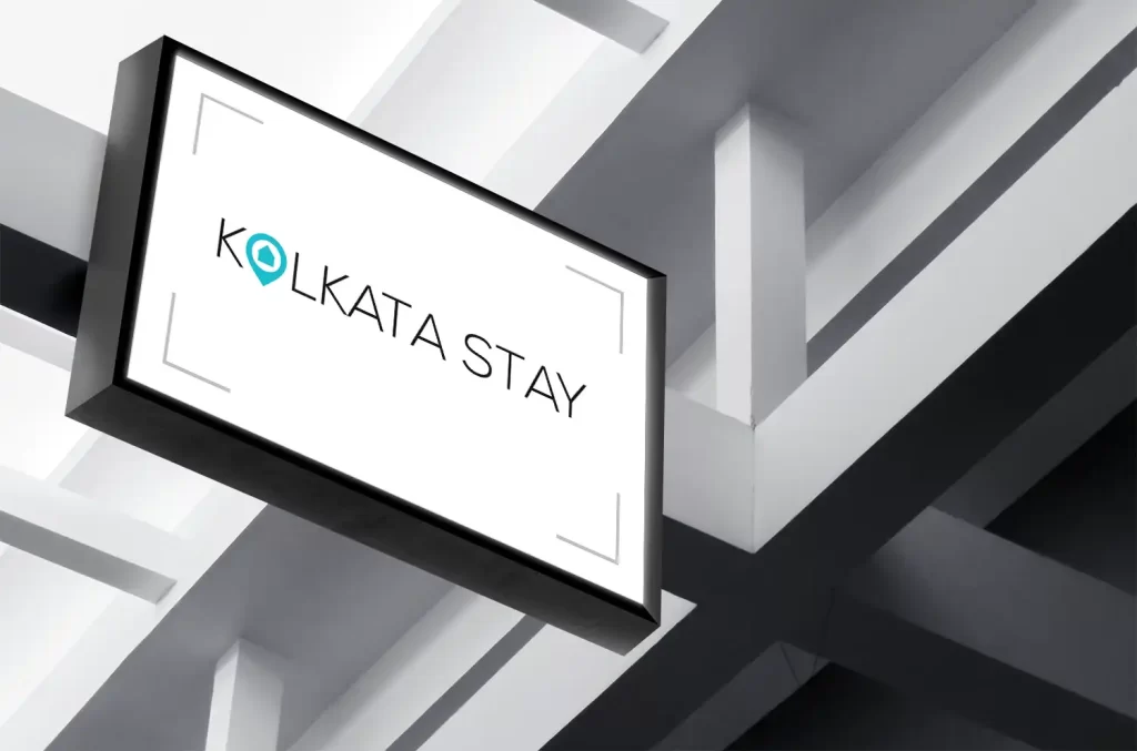
- Minimal and light typography: APH opted for a clean and minimalist font that exuded simplicity and sophistication. This choice aimed to evoke a sense of professionalism and reliability, instilling confidence in potential guests.
- Location pin balloon icon: To emphasize the strategic location of the homestays, APH creatively replaced the first “O” in “Kolkata” with a location pin balloon. This visually represented the convenience and accessibility of the properties, capturing the attention of prospective guests.
- Monochrome with a touch of blue: The overall logo design maintained a sleek and timeless monochrome color scheme, symbolizing elegance and professionalism. To draw attention to the location pin balloon icon, a light blue color was utilized. This subtle touch of color added a sense of tranquility and hinted at the refreshing experiences that awaited guests at Kolkata Stay Homestays.
Results:
The new brand identity designed by APH for Kolkata Stay Homestays successfully addressed the client’s objectives and aspirations. The minimal and light typography, combined with the location pin balloon icon, effectively conveyed the brand’s trustworthiness and emphasized its strategic location. The monochrome color scheme with the touch of blue added a touch of sophistication and tranquility to the overall visual identity. The revamped brand identity enabled Kolkata Stay Homestays to position itself as a reliable and welcoming choice for families seeking memorable and convenient stays in Kolkata.