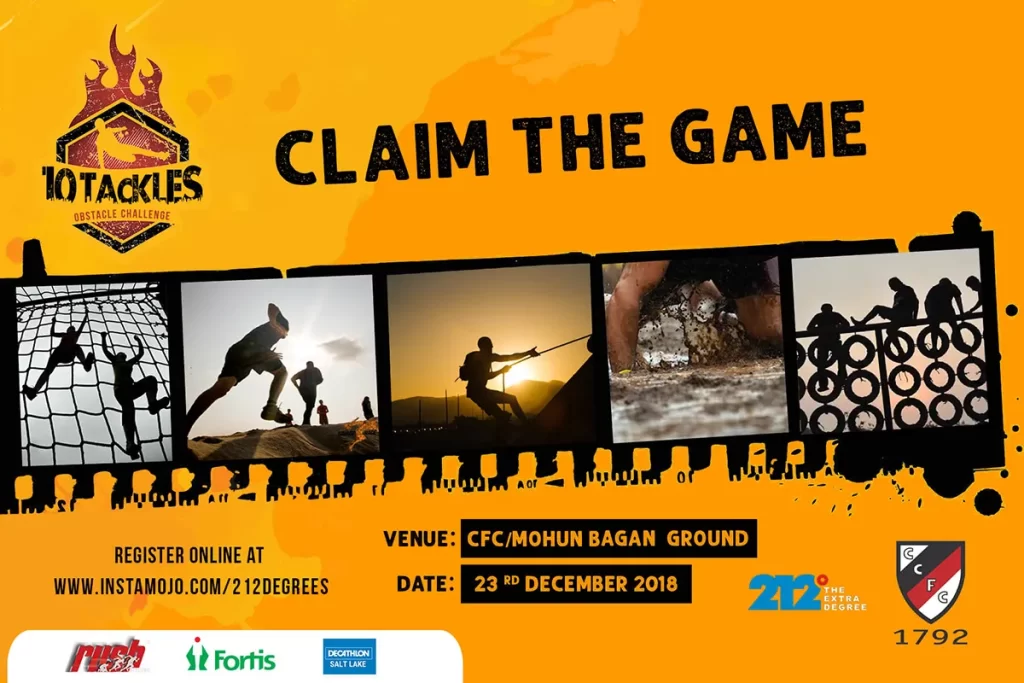
10Tackles, a one-of-a-kind fitness and adventure funfest, aimed to create an exhilarating experience for participants through Kolkata’s maiden obstacle challenge race. As the largest obstacle challenge race in Eastern India, 10Tackles sought a captivating logo that would embody the spirit of adventure and convey the physical and mental challenges participants would face. APH was entrusted with the task of designing a logo that captured the ruggedness, excitement, and skyline of the city.
Situation
10Tackles recognized the need for a distinctive logo that would serve as a visual representation of their unique fitness event. They aimed to communicate the physical and mental challenges participants would encounter while highlighting the event’s scale and significance as the largest obstacle challenge race in Eastern India. APH was approached to design a logo that would capture the essence of the event and resonate with the target audience.
Complication
The challenge lay in creating a logo that effectively conveyed the excitement, adventure, and physicality of the obstacle challenge race. It was essential to capture the ruggedness of the event the logo needed to be visually striking, memorable, and reflective of the intense and thrilling nature of the race.
Question
How could APH design a logo that would effectively capture the spirit of adventure, showcase the physical and mental challenges of the obstacle race, and incorporate elements representing the city of Kolkata?
Answer
APH embarked on a creative journey to design a logo that would visually represent the essence of 10Tackles. Through extensive research and collaboration with the event organizers, APH aimed to create a logo that captured the ruggedness, excitement, and unique features of the obstacle challenge race.
Solution
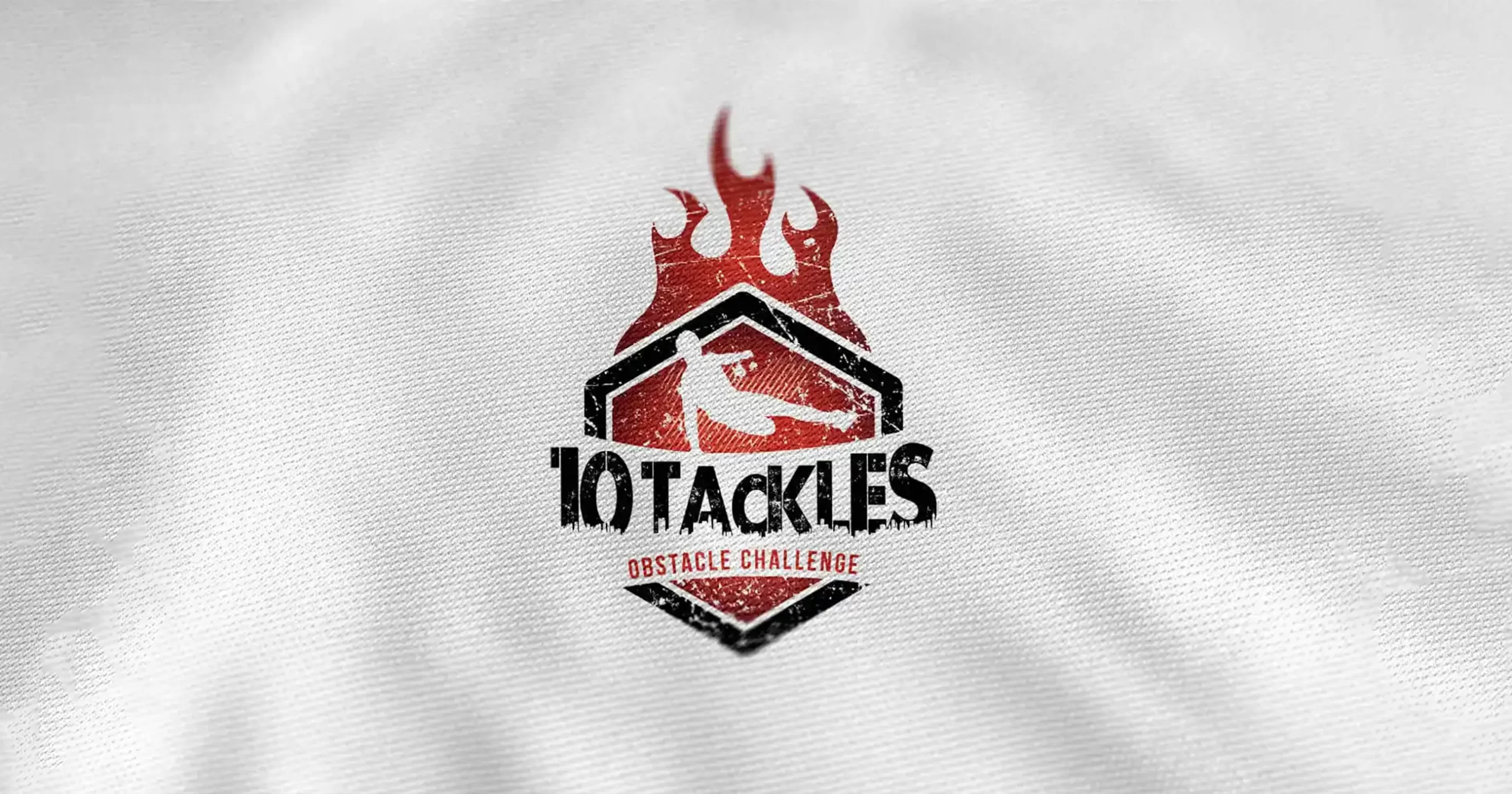
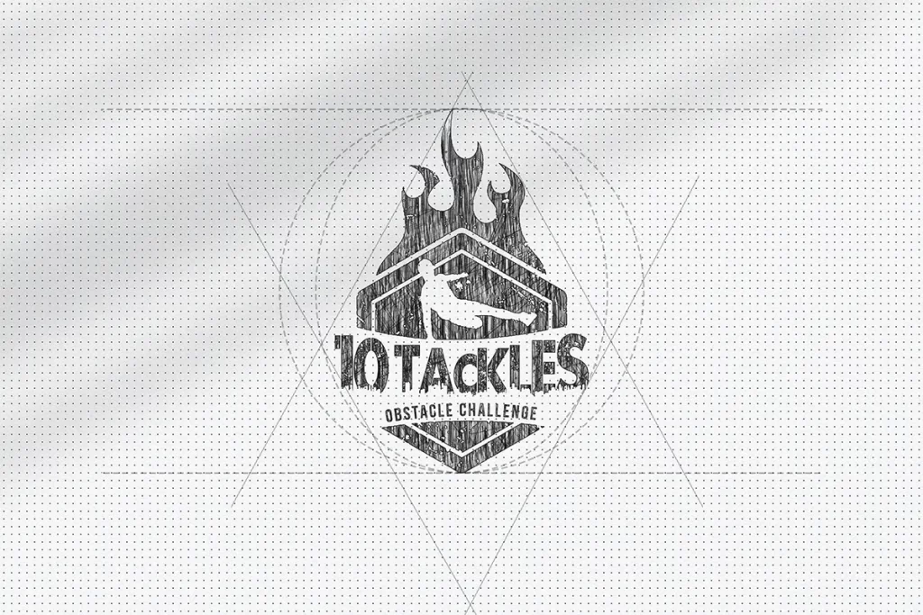
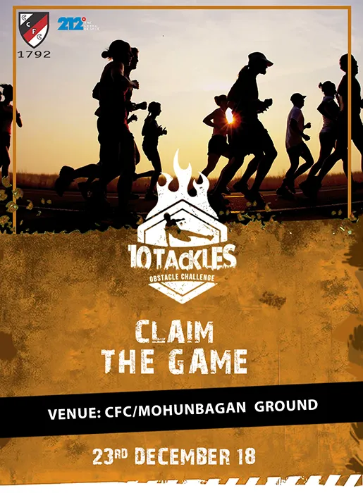
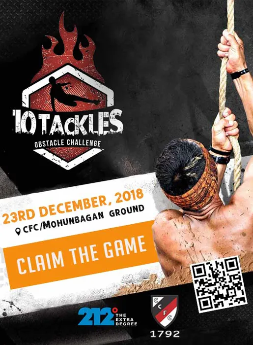
The logo design process began with the creation of a dynamic logo icon that featured a silhouette of a man jumping over an obstacle. The icon was placed inside a hexagon-like shape, representing the challenges and barriers participants would face during the race. The rugged and textured look of the logo symbolized the physicality of the event and evoked a sense of adventure.
The color palette incorporated a brownish-red tone, reminiscent of fire, to enhance the intensity and energy of the logo. This color choice further reinforced the ruggedness and excitement associated with the obstacle challenge race. The wordmark “10Tackles” was designed with rugged edges, showcasing the skyline of an urban setting, which added a local touch and connected the event to its host city.
Outcome
The final logo design by APH successfully captured the spirit of adventure, physical challenges, and local connection of 10Tackles. The dynamic logo icon featuring a man jumping over an obstacle inside a hexagon-shaped element instantly communicates the excitement and intensity of the race. The rugged look and brownish-red color palette evoke a sense of adventure and ignite participants’ enthusiasm.
The incorporation of the Kolkata skyline in the wordmark adds a local flavor and strengthens the connection between the event and the host city. The logo’s visual impact and unique design have contributed to increased brand recognition and excitement surrounding 10Tackles as Kolkata’s maiden obstacle challenge race.
Conclusion
Through a strategic collaboration with APH, 10Tackles achieved their goal of creating a captivating logo that embodies the spirit of adventure, physical challenges, and the unique nature of the obstacle challenge race. The dynamic logo design with a rugged look, silhouette of a jumping man, and incorporation of the Kolkata skyline successfully conveys the excitement, intensity, and local connection of the event.
The logo has played a crucial role in increasing brand visibility, attracting participants, and generating enthusiasm for 10Tackles. The visually striking logo has become a symbol of the event’s unique offerings, positioning