AG Capital, a renowned financial services conglomerate with over 20 years of expertise, sought to elevate its brand identity and establish a powerful visual representation. Through a strategic collaboration, our agency designed a distinctive logo and website that encapsulated AG Capital’s reputation for comprehensive and integrated financial solutions. This case study delves into the process, challenges, and remarkable outcomes of our logo designing services for AG Capital.

Understanding the Essence
By delving deep into AG Capital’s core values, market position, and aspirations, we gained invaluable insights into their brand essence. We discovered the need for a logo that embodies professionalism, trustworthiness, and dynamic growth. With these principles in mind, we embarked on the journey to craft a visually compelling identity.
Crafting the Icon
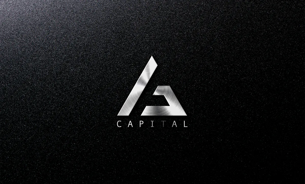
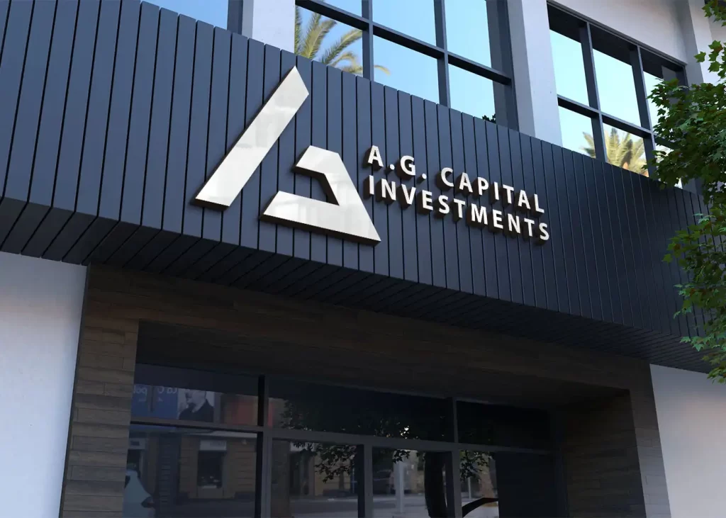
The icon of AG Capital’s logo is a seamless fusion of the letters “A” and “G,” representing the company’s initials. The sleek, cobalt blue design exudes a sense of stability and reliability, echoing AG Capital’s expertise in the financial industry. The icon’s unique feature—a slanting line in the letter “A”—symbolizes the institution’s commitment to driving financial growth and prosperity for its clients.

Wordmark Excellence
The wordmark component of the logo utilizes a clean and sophisticated typeface, reflecting AG Capital’s professionalism and attention to detail. The careful selection of typography ensures readability and enhances the overall aesthetic appeal. The cobalt blue color palette maintains consistency and reinforces the brand’s identity across various touchpoints.
Seamless Integration
The logo seamlessly integrates with AG Capital’s brand identity, harmonizing with its mission, vision, and overall communication strategy. The cobalt blue color evokes trust, reliability, and confidence, instilling a sense of reassurance in AG Capital’s clients and stakeholders.
Impressive Outcomes
The newly designed logo has made a significant impact on AG Capital’s brand presence. It serves as a visual anchor, instilling a sense of trust and reliability among its diverse client base. The logo has become synonymous with AG Capital’s commitment to comprehensive financial solutions, elevating the brand’s perception and positioning in the market.
Conclusion
Through a meticulous and collaborative approach, our agency successfully crafted a compelling logo and website for AG Capital. The logo’s distinct design elements, including the iconic fusion of the letters “A” and “G” and the cobalt blue color palette, have played a pivotal role in reinforcing AG Capital’s brand identity. With our expertise in logo designing, we have empowered AG Capital to make a lasting impression in the financial services industry, setting them apart as a trusted and innovative leader.