In an industry driven by advanced technology and manufacturing excellence, Kessler Copper Industries Pvt. Ltd. recognized the need to establish a strong brand identity that would resonate with its target audience. To accomplish this, Kessler Copper Industries partnered with APH, a leading design agency known for its expertise in creating impactful brand identities. This case study delves into the collaborative process, strategic decisions, and creative execution that led to the successful redesign of Kessler Copper Industries’ logo and brand identity.
The Challenge: Crafting a Distinctive
- Understanding the competitive landscape and the importance of brand differentiation
- Identifying the need for a brand identity that conveys the company's strengths and values
Discovery and Research: Unveiling the Essence of Kessler Copper Industries
- Conducting in-depth interviews and workshops with key stakeholders to understand the company's aspirations, core values, and target audience
- Analyzing market trends and competitor analysis to identify unique positioning opportunities
Conceptualization and Design Strategy: Unleashing the Power of Copper and Technology
- Brainstorming sessions to generate creative concepts that align with the company's values and aspirations
- Exploring visual elements that symbolize strength, precision, and innovation, with a focus on copper and technology
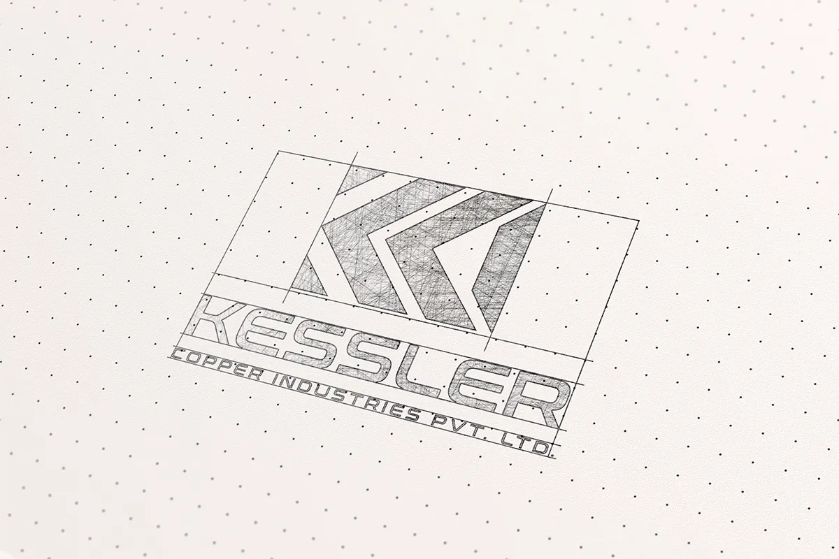
Icon Design: Symbolizing Strength, Precision, and Innovation
- Creating sketches and digital renderings of potential icons that capture the essence of Kessler Copper Industries
- Refining and iterating on the chosen icon concept, incorporating feedback from stakeholders
Wordmark Design: Modern and Straightforward Representation of Reliability
- Selecting a clean and modern typeface that reflects the company's commitment to reliability and professionalism
- Customizing and refining the wordmark to ensure visual harmony with the chosen icon
Color Palette: Embracing the Warmth and Robustness of Copper Tones
- Choosing a color palette that conveys the warmth, richness, and robustness of copper
- Exploring complementary colors and gradients to enhance visual appeal and evoke emotions
Visual Cohesion: Creating a Memorable and Cohesive Brand Identity
- Ensuring seamless integration of the icon and wordmark to create a visually cohesive logo
- Establishing guidelines for logo usage across various applications to maintain consistency
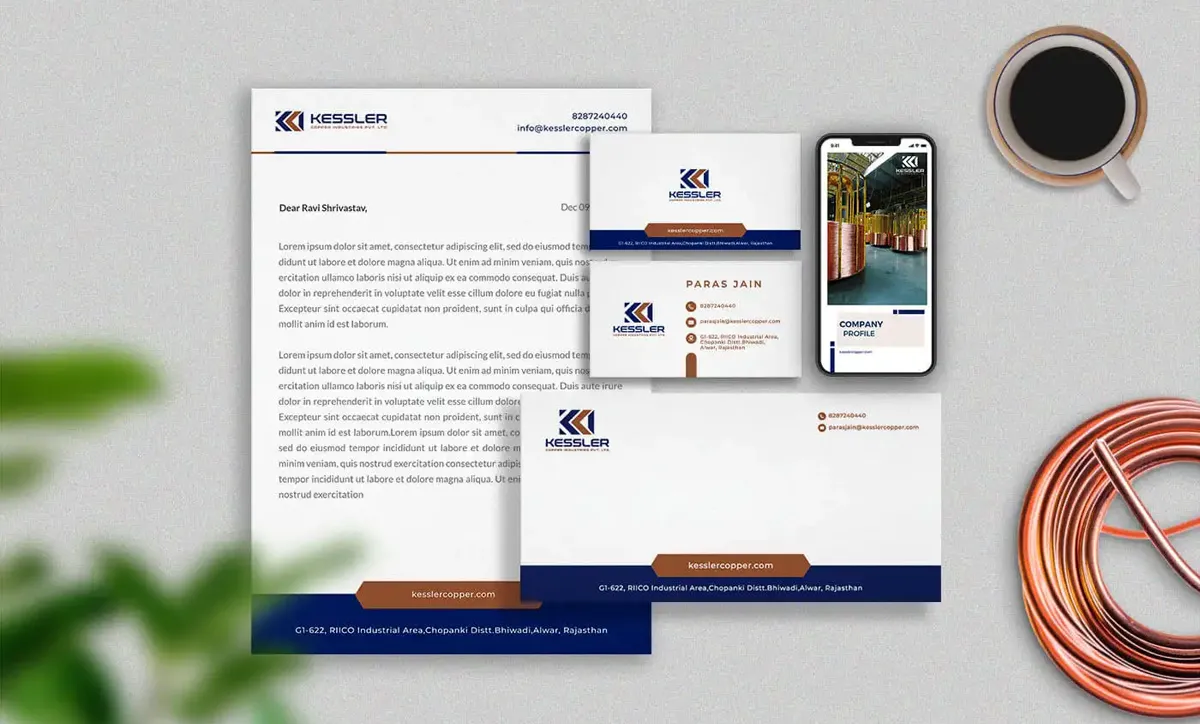
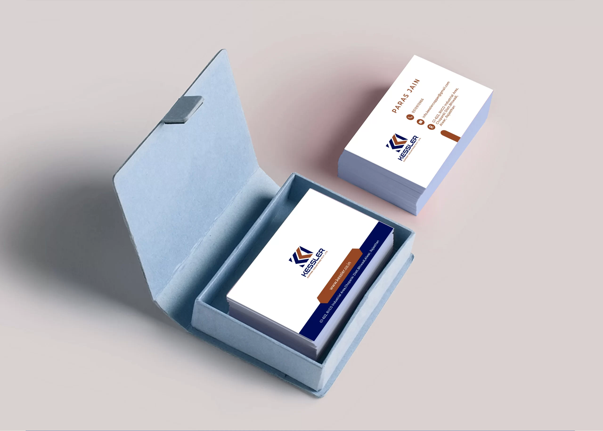
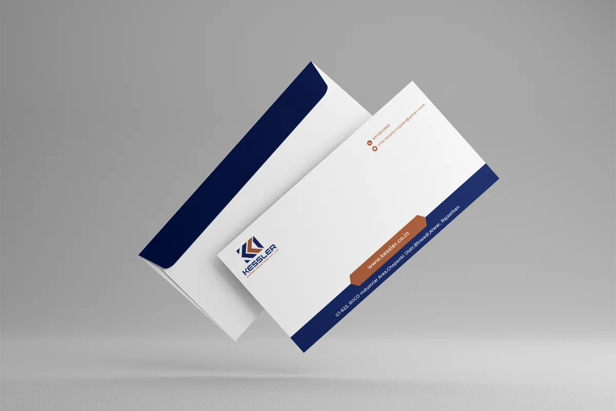
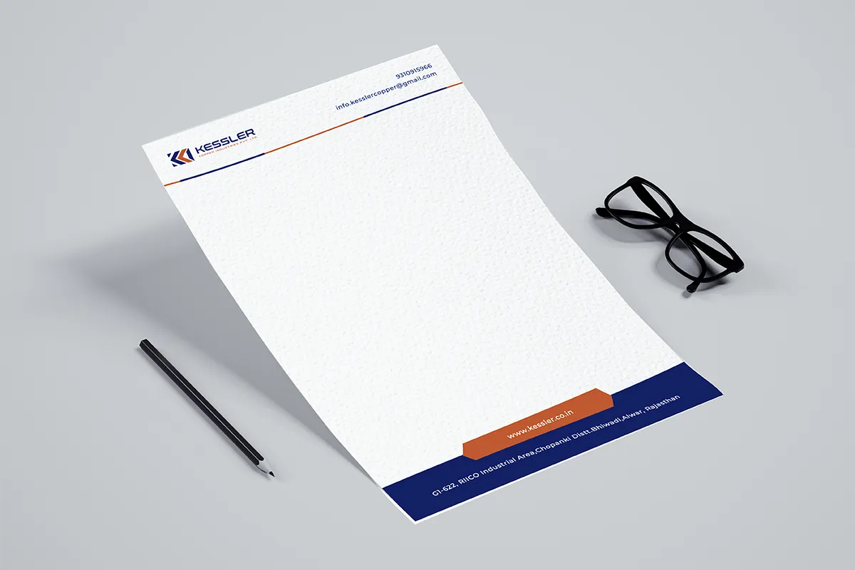
Application and Adaptation: Infusing the Brand Identity Across Touchpoints
- Designing and implementing the brand identity across various touchpoints, including stationery, marketing collateral, and digital platforms
- Adapting the logo and brand elements to different sizes and formats while maintaining visual integrity
Impact and Reception: Resonating with the Target Audience and Industry Peers
- Conducting user testing and gathering feedback from internal and external stakeholders
- Monitoring the brand's reception and tracking key metrics, such as increased brand recognition and customer engagement
Conclusion: Empowering Kessler Copper Industries with a Strong Brand Identity
- Summarizing the successful transformation of Kessler Copper Industries' brand identity
- Highlighting the positive impact on the company's reputation, customer perception, and market positioning
This comprehensive case study showcases how APH’s strategic approach, creative expertise, and collaborative partnership with Kessler Copper Industries resulted in a powerful and impactful brand identity. The redesigned logo and brand identity successfully convey the company’s strengths, values, and commitment to excellence, positioning Kessler Copper Industries as a leader in the copper wire manufacturing industry.