NGB is a prominent manufacturing company based in Eastern India, renowned for its extensive product range, which includes signage, security seals, safety caps, and more. Over the years, NGB has earned a reputation as one of the region’s leading manufacturers in the signage industry. However, as part of their growth strategy, they recognized the importance of elevating their brand identity to better reflect their precision and expertise in the market. NGB is an established branding consultant and signage manufacturer with a pan-India presence.
Complication
Although NGB had a strong presence and reputation in the industry, their existing logo did not effectively convey their engineering prowess and precision. They wanted a logo that would accurately reflect their commitment to excellence and position them as a trusted partner for their clients.
Question
How can NGB develop a new logo that captures their precision and expertise while maintaining a contemporary and bold aesthetic?
Answer
To address NGB’s branding needs, we embarked on a logo redesign project. Our goal was to create a logo that would visually represent their engineering prowess and precision, while also conveying a contemporary and bold vibe. We aimed to develop a logo that would resonate with their target audience and enhance their brand identity.
Solution
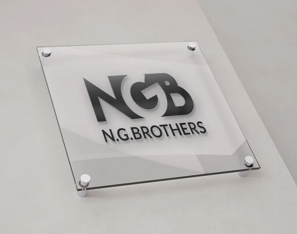
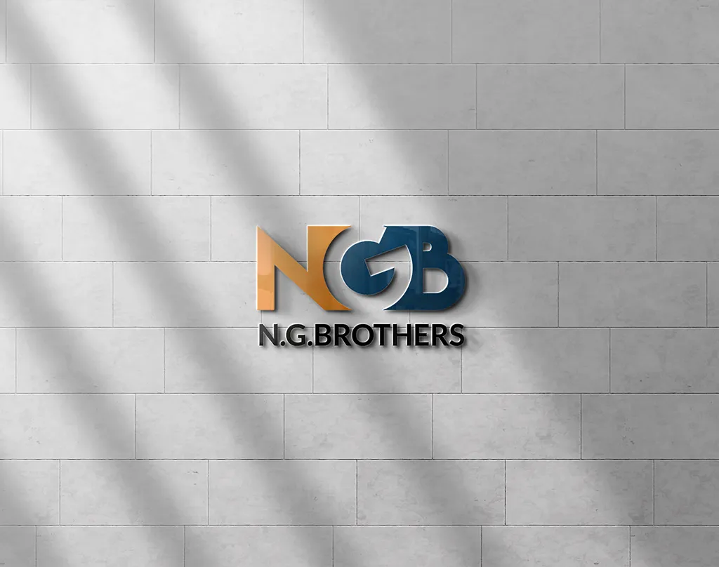
After a thorough exploration of design concepts, we crafted a new logo that perfectly aligned with NGB’s requirements. The logo featured the initials “N,” “G,” and “B” merged together in a visually striking manner. The “N” was rendered in vibrant orange, representing energy and creativity. The “G” was designed in blue, symbolizing trust and reliability. The negative space between the “N” and “B” formed the letter “G,” representing precision and attention to detail.
Furthermore, we created a wordmark that complemented the logo’s contemporary and bold aesthetic. The wordmark was simple, yet impactful, using a clean and modern typeface. The combination of the logo and wordmark effectively communicated NGB’s expertise and positioned them as a leader in the industry.
Results
The new logo and brand identity were enthusiastically received by NGB and their clients. The logo’s vibrant colors, bold design, and symbolic representation of precision and expertise resonated with the target audience. It successfully conveyed NGB’s core values and positioned them as a reliable and trusted partner in the industry.
The redesigned logo was implemented across various brand collaterals, including their website, stationery, and marketing materials. The cohesive brand identity enhanced NGB’s professional image and contributed to increased brand recognition and trust among their existing and potential clients.
Conclusion:
Through a comprehensive logo redesign, NGB successfully transformed their brand identity and aligned it with their core values of precision and expertise. The new logo, with its vibrant colors, bold design, and symbolic representation, effectively communicated NGB’s unique positioning in the industry. The revamped brand identity has positively impacted their business, enhancing their reputation and attracting new clients. NGB is now well-positioned to continue their growth and success as a leading branding consultant and signage manufacturer in India.