Introduction
Shivam Stones is a renowned manufacturer and exporter of high-quality paving stones, specializing in Indian sandstone, limestone, and European porcelain. With a strong focus on ethical sourcing and certification, Shivam Stones has established itself as a trusted name in the industry. This case study explores the logo design journey of Shivam Stones, highlighting the incorporation of their brand initials, the global appeal, and the representation of their diverse product range.
Objective:
The primary objective of designing Shivam Stones’ logo was to create a visual identity that reflected their position as a leading manufacturer and exporter of paving stones. The logo needed to communicate the brand’s commitment to ethical sourcing, global reach, and the diverse range of products they offer.
Design Process:
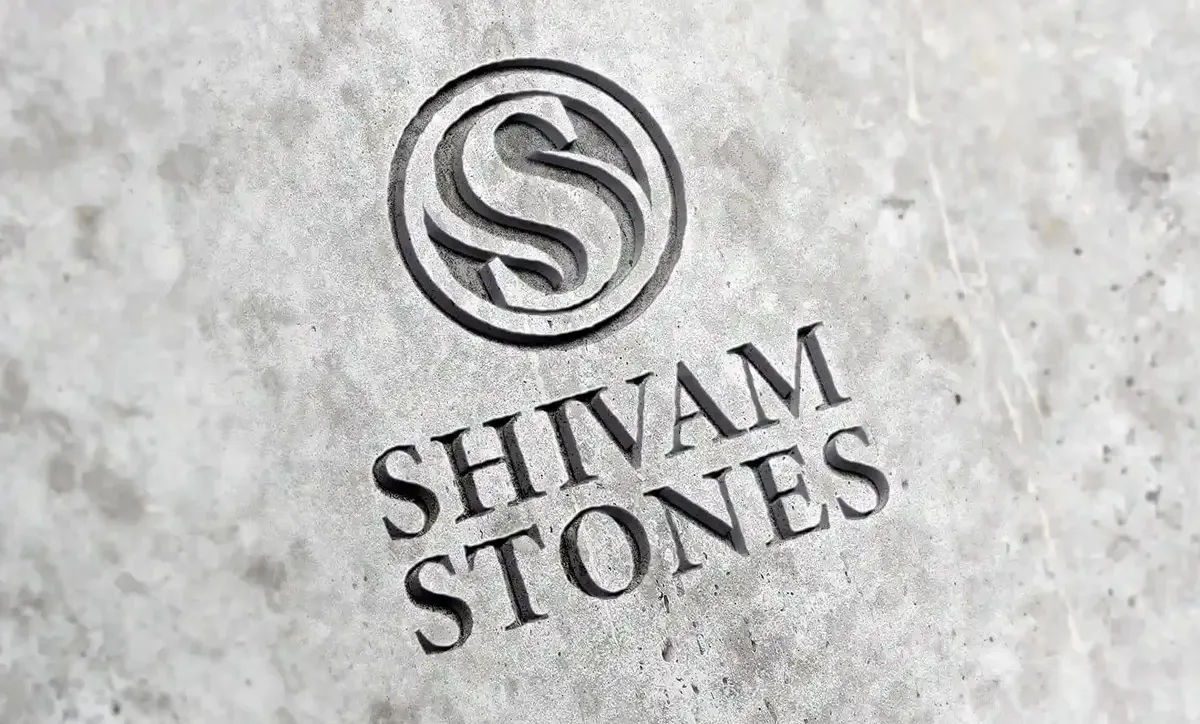
- Brand Initials: The design team at Shivam Stones recognized the significance of the brand initials in capturing their identity. They chose to incorporate the two S’s into a circular emblem, symbolizing unity and completeness. One of the S’s was rendered bolder to create a focal point within the logo.
- Curved Elements: To represent the diverse product range of paving stones, the second S was designed to form two gentle curves on both sides of the bolder S. These curves symbolized the variety of materials and styles offered by Shivam Stones, showcasing their expertise in Indian sandstone, limestone, and European porcelain.
- Monochrome Palette: The logo was designed using a monochrome color scheme, creating a timeless and sophisticated aesthetic. The use of black and white conveyed professionalism and elegance while ensuring versatility across various applications.
- Wordmark Placement: The wordmark was positioned below the emblem, using a bold and clean professional font. This placement allowed the emblem to take center stage while providing clear and legible typography that reinforced Shivam Stones’ global appeal and business expertise.
Result
The final logo design successfully captured the essence of Shivam Stones’ brand identity. The circular emblem with the intertwined S’s symbolized unity, completeness, and their commitment to delivering quality paving stones. The bold and clean wordmark below the emblem conveyed professionalism and highlighted the brand’s global reach.
Impact
The redesigned logo became an integral part of Shivam Stones’ brand image. It enhanced their visual presence, conveying a sense of trust, quality, and global expertise. The logo appeared on their website, product packaging, marketing materials, and trade show displays, reinforcing their brand identity and facilitating recognition in both domestic and international markets.
Conclusion
The logo design for Shivam Stones successfully represented the brand’s commitment to ethical sourcing, diverse product range, and global appeal. By incorporating the brand initials into a circular emblem and using a monochrome palette, the logo exuded professionalism, elegance, and a sense of unity. The bold wordmark positioned below the emblem emphasized the brand’s expertise and global reach. Overall, the logo played a crucial role in enhancing Shivam Stones’ brand recognition, establishing their presence in the industry, and appealing to their target audience across the globe.